Givingli
BRAND IDENTITY
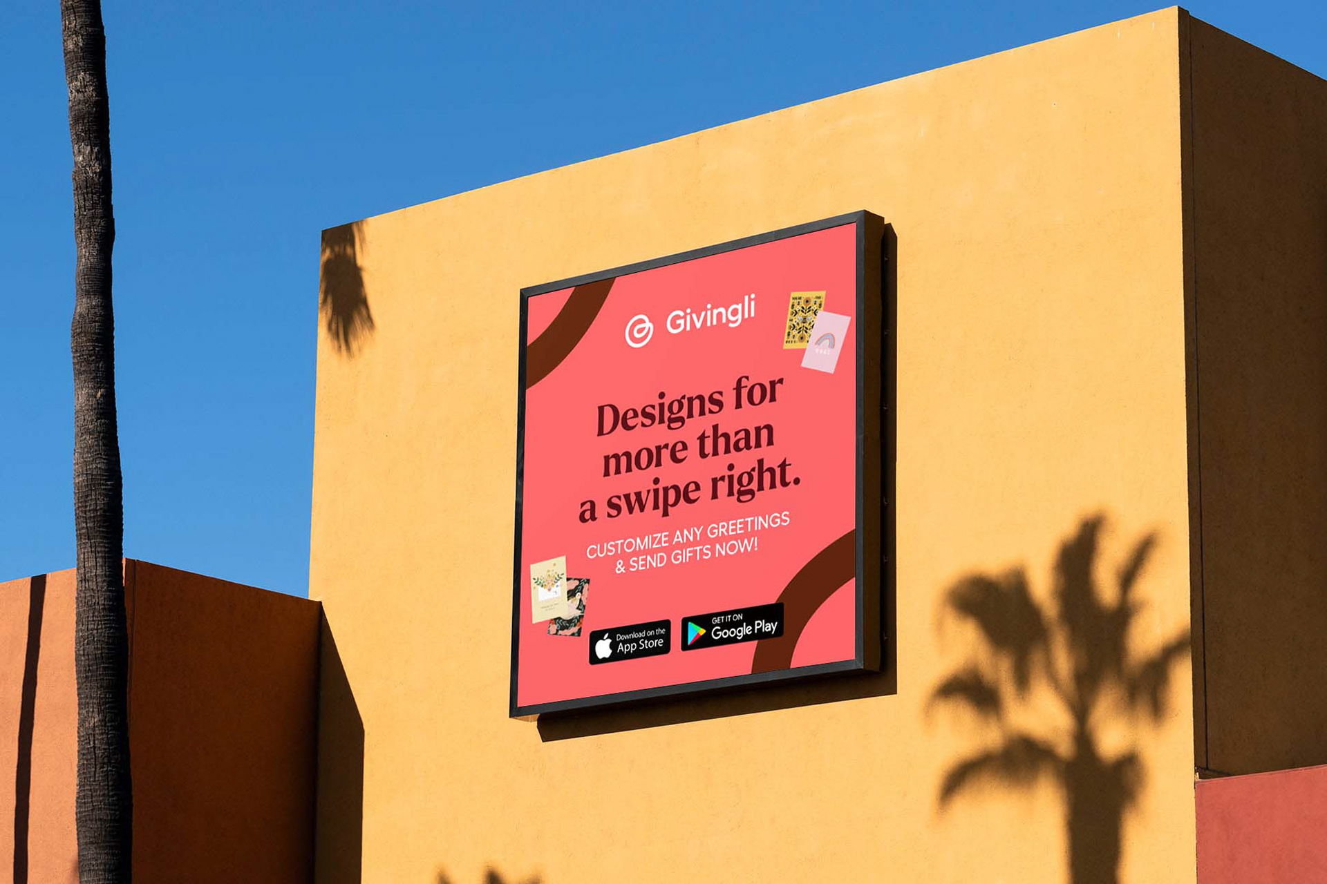
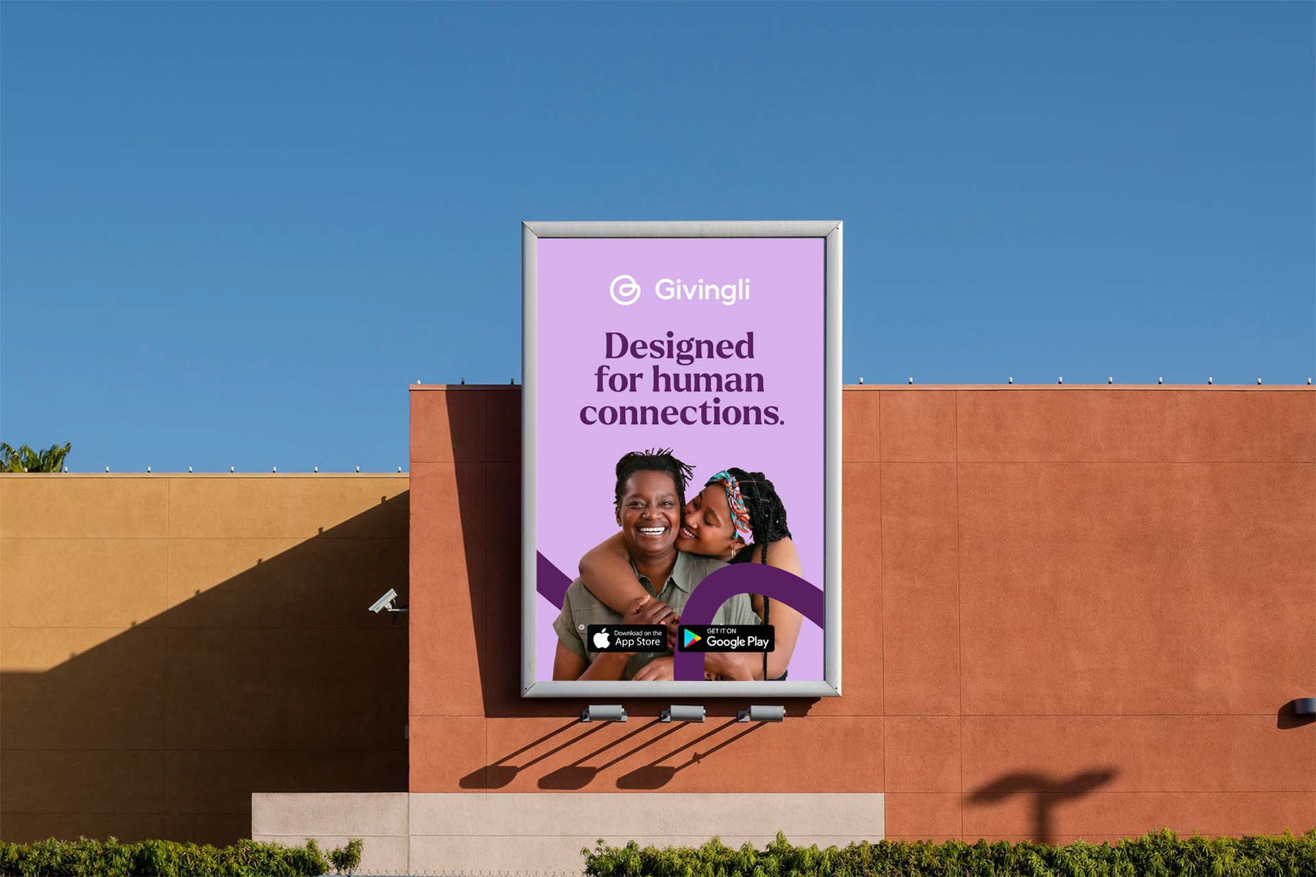
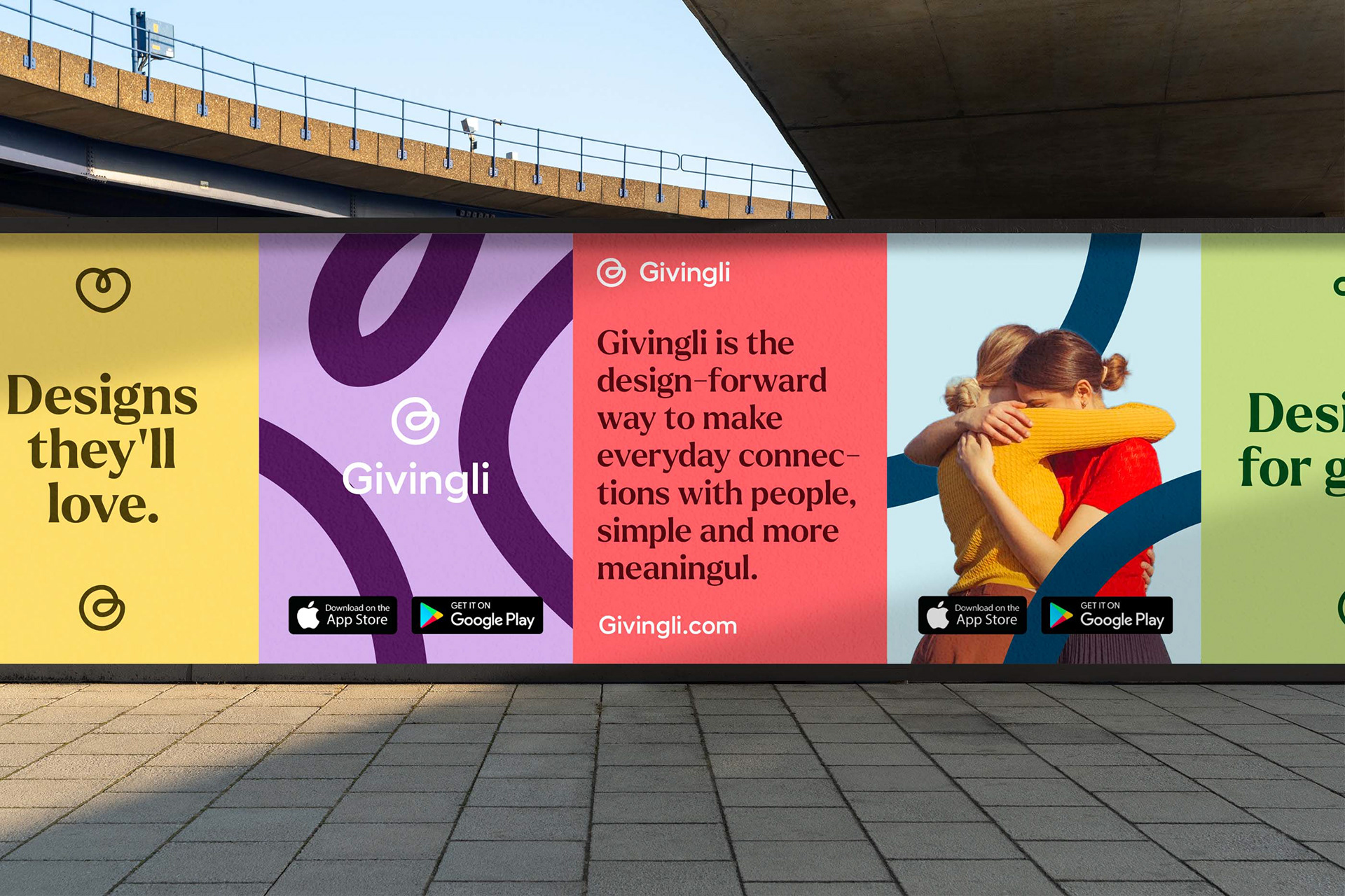
Givingli is the design-forward way to make everyday connections with people, simple and more meaningful.
Challenge
The team in charge of 21ST at CentraleSupéléc contacted me to help them create a visual identity that stands out by its ambitions and its clear positioning. Wishing to help ambitious start-ups build the world of tomorrow, the image of 21ST had to reflect a certain assurance. With more and more incubators on the market, 21ST had to differentiate itself through a strong and committed image.
Solution
The system had to be flexible according to the different media and the different themes addressed. Human Odyssey in red, Ecosystem Regeneration in green and Business Revolution in blue-violet.
The main typography, Stratos, carries the values of 21ST. Wishing to impact society through its actions and current issues. This typographic choice affirms a will of change without compromise. The result is a visual identity that carries the values and ambitions of 21ST through a flexible and recognizable system without seeing the logo.
