Cycle
BRAND IDENTITY
A creative collective that hosts creative camps to connect the talents of tomorrow with the experts of today to create the unexpected.
Challenge
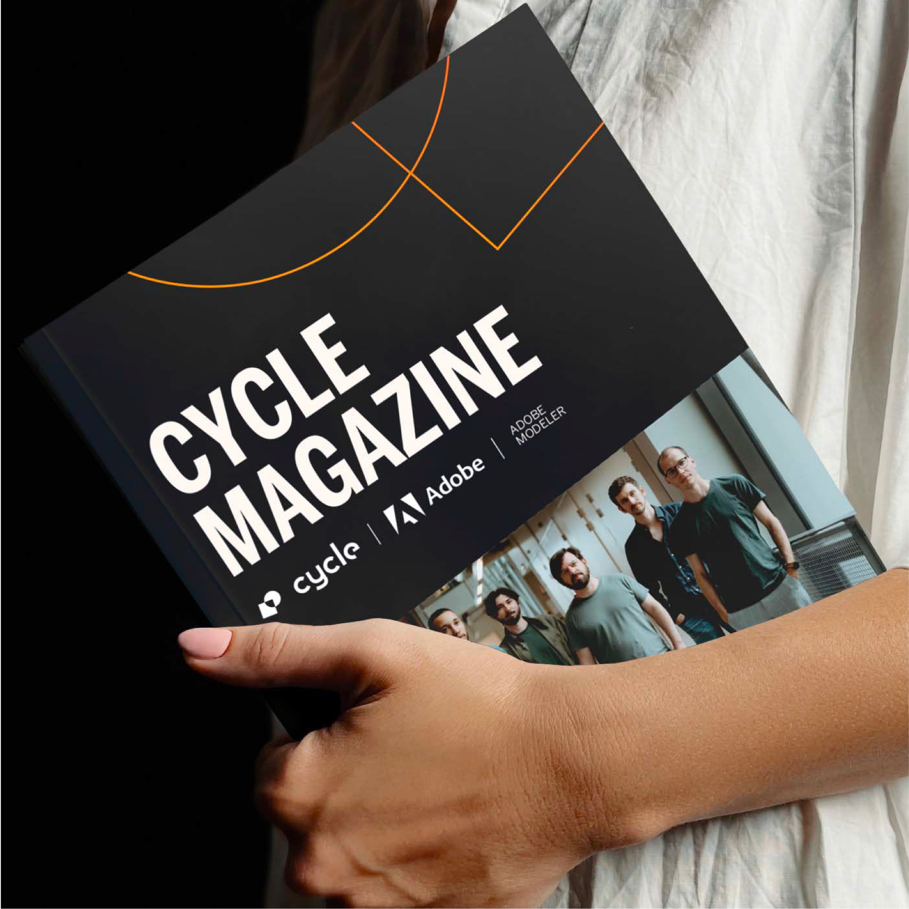
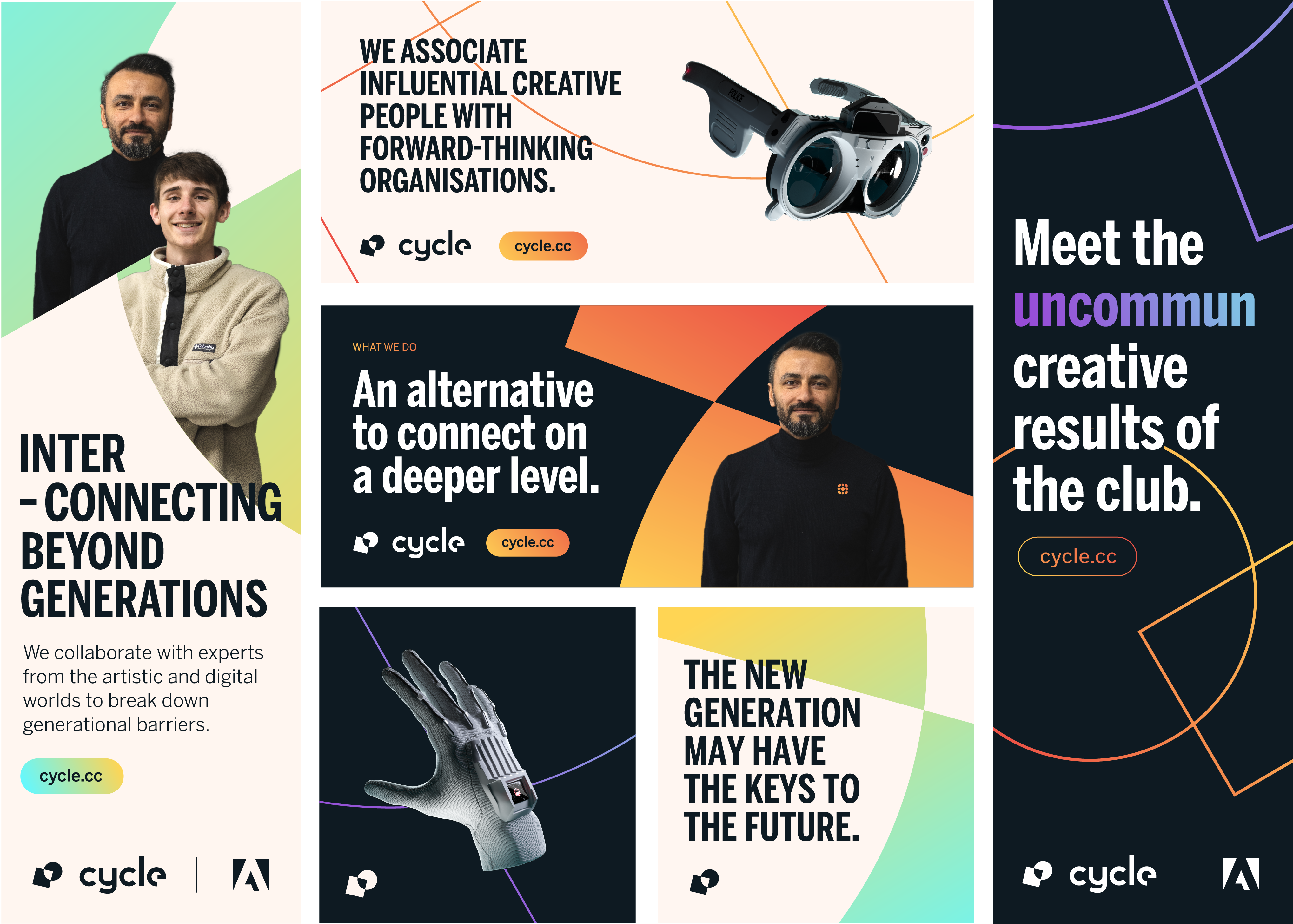
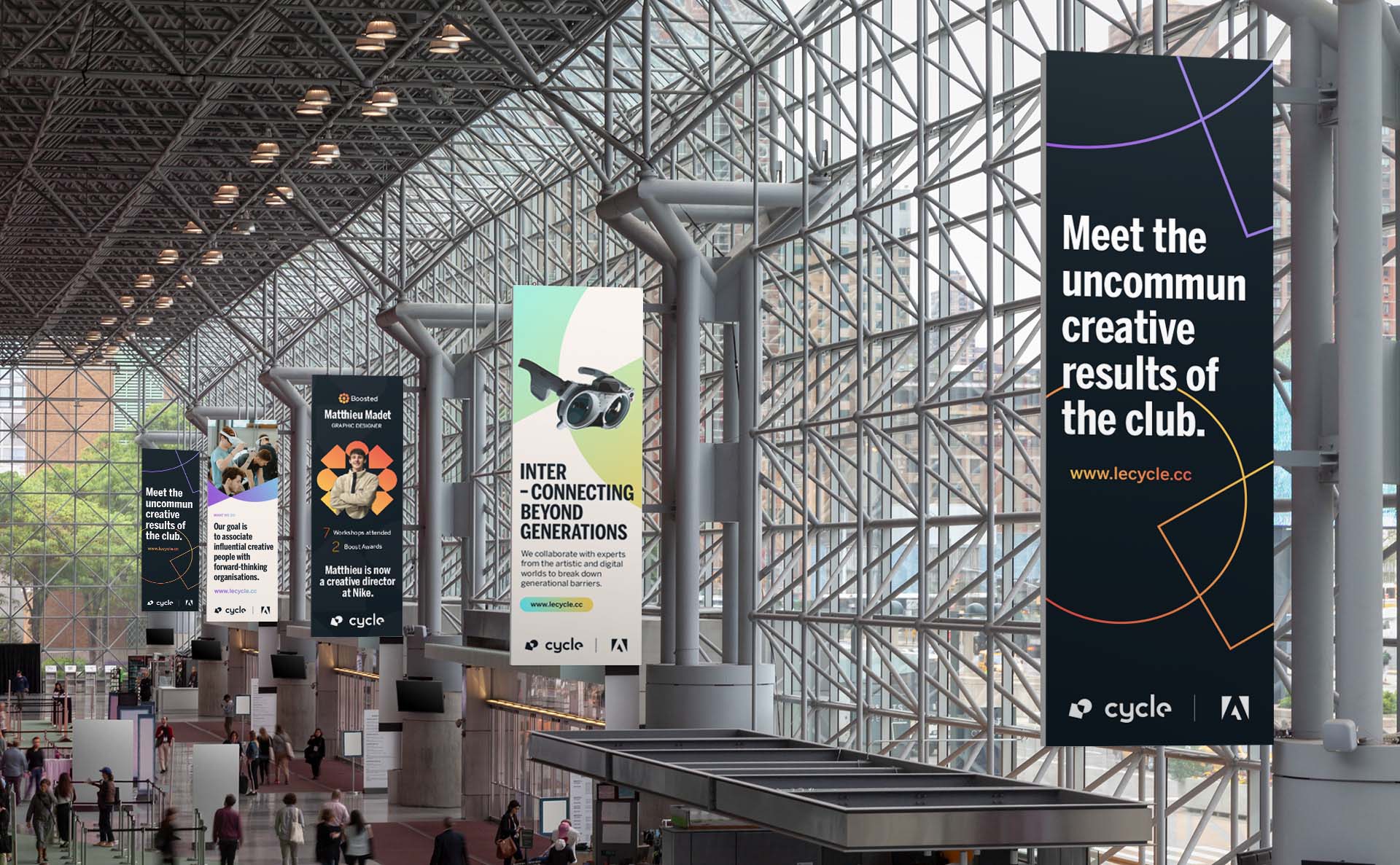
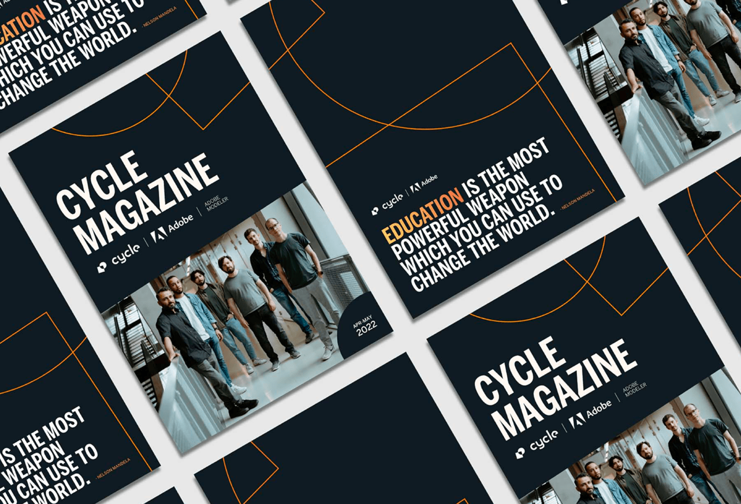
My friends at Cycle asked me to help them build the brand identity of Cycle that represent a blend between the freshness of talents they support with experts from their industries. The brand identity had to convey that sense of unexpected cocktail creation from those two worlds.
Solution
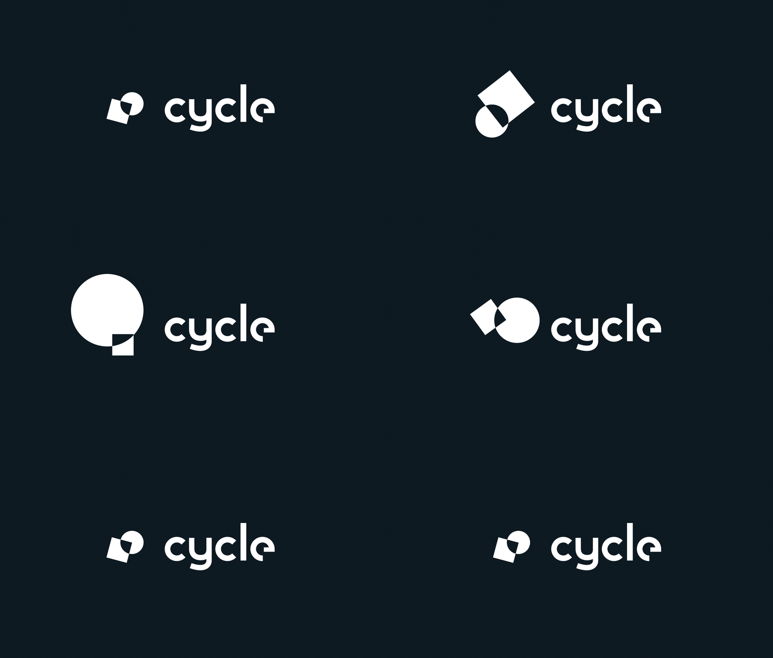
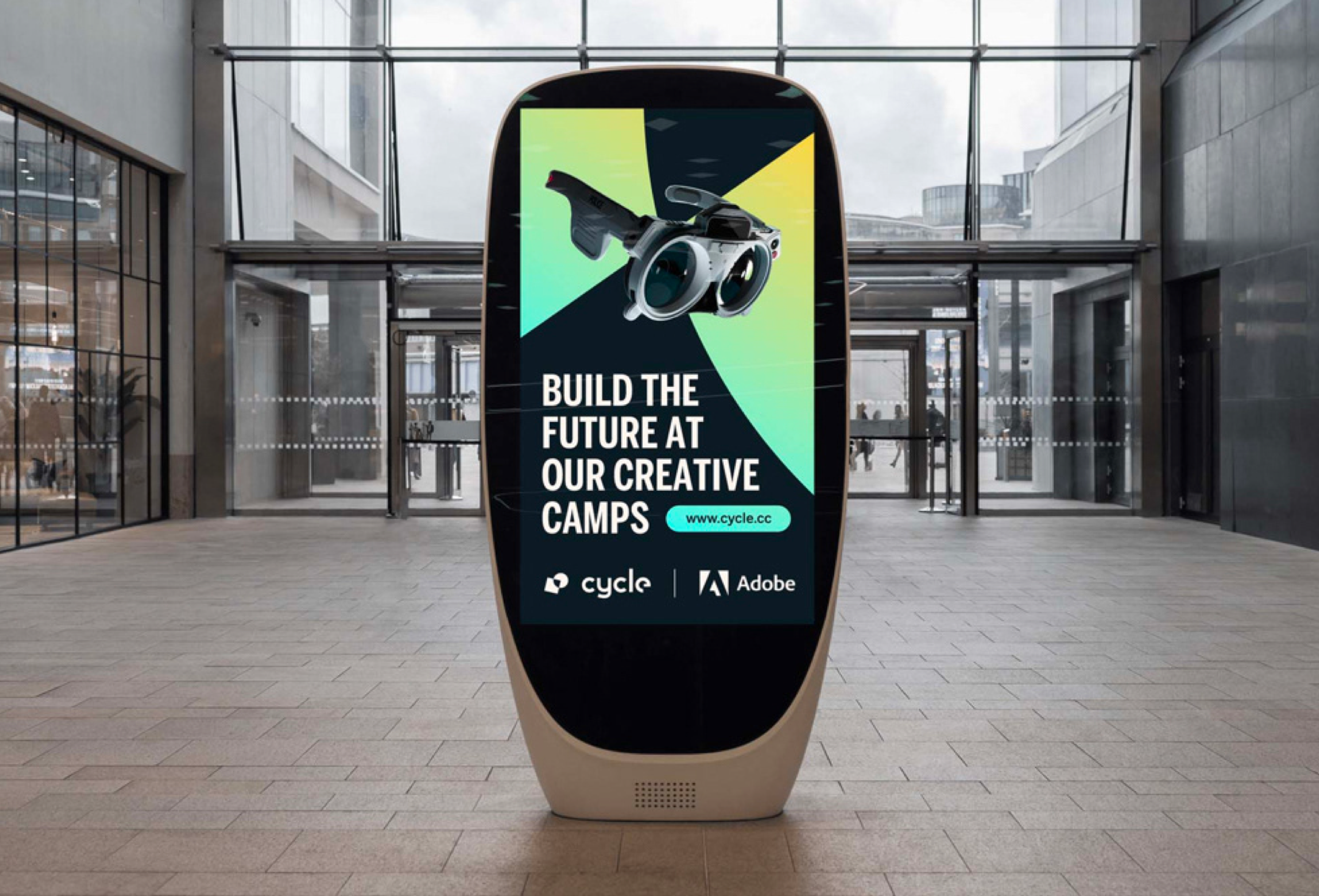
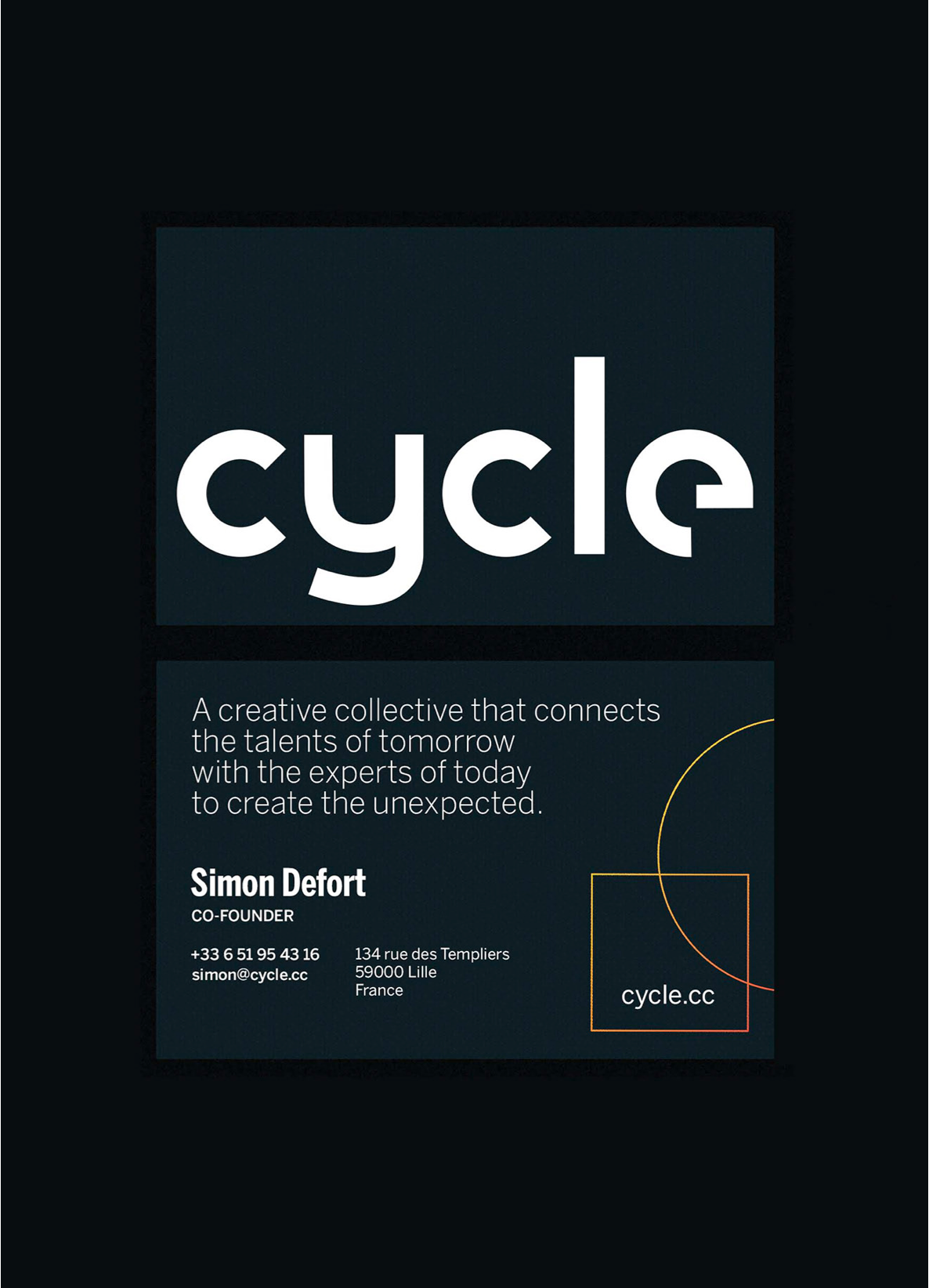
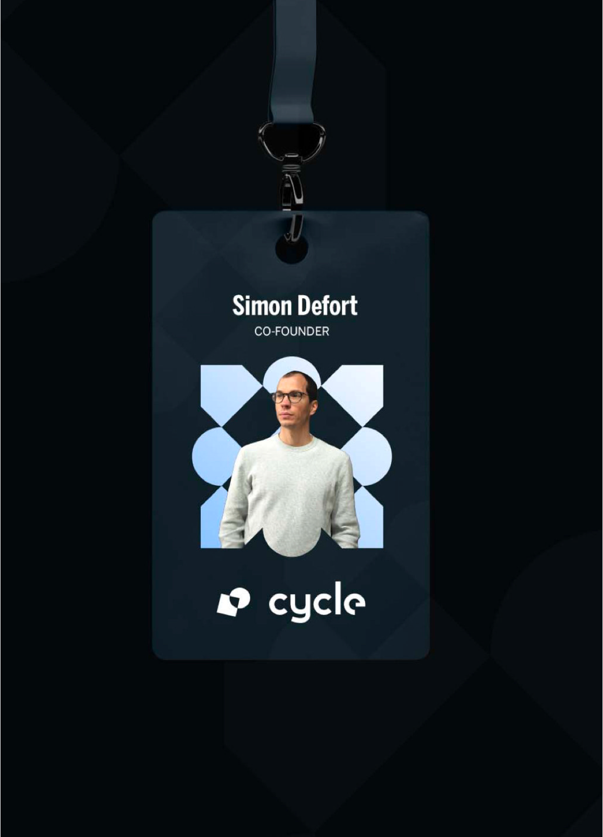
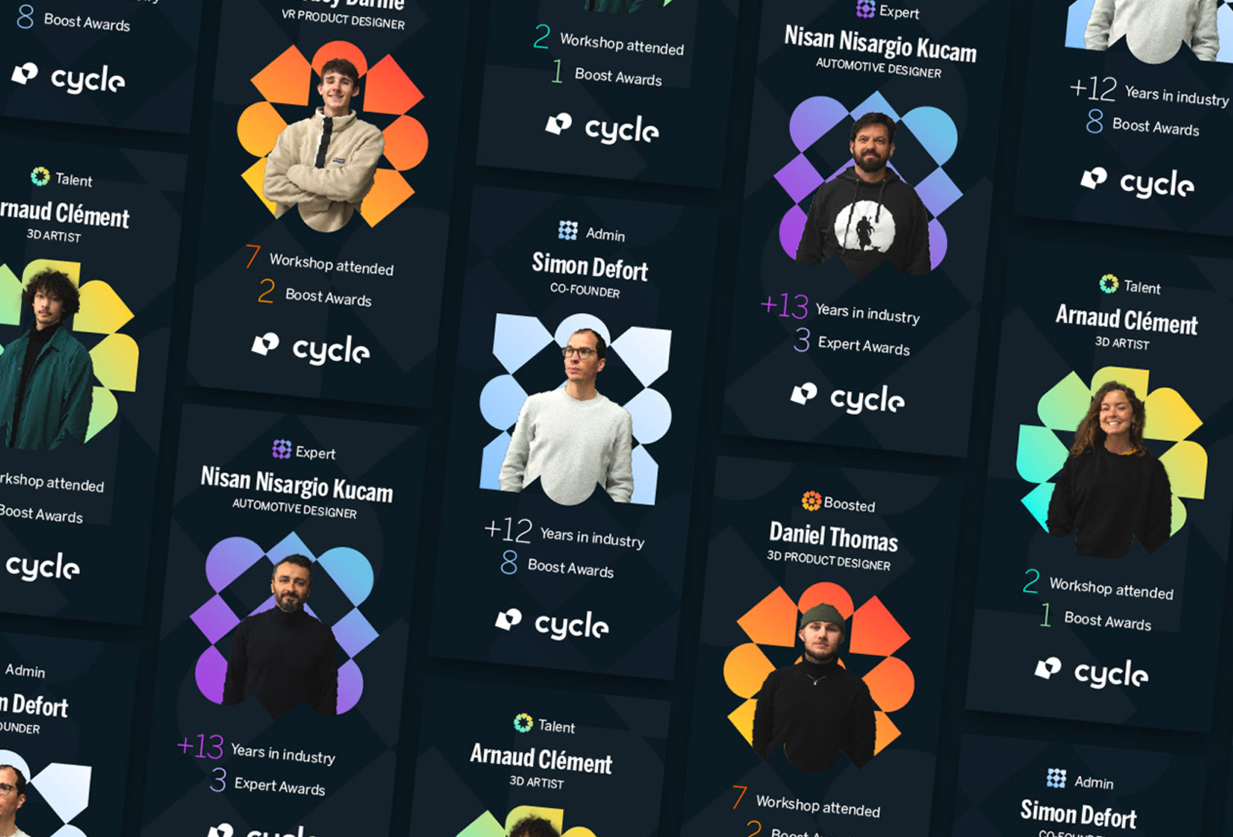
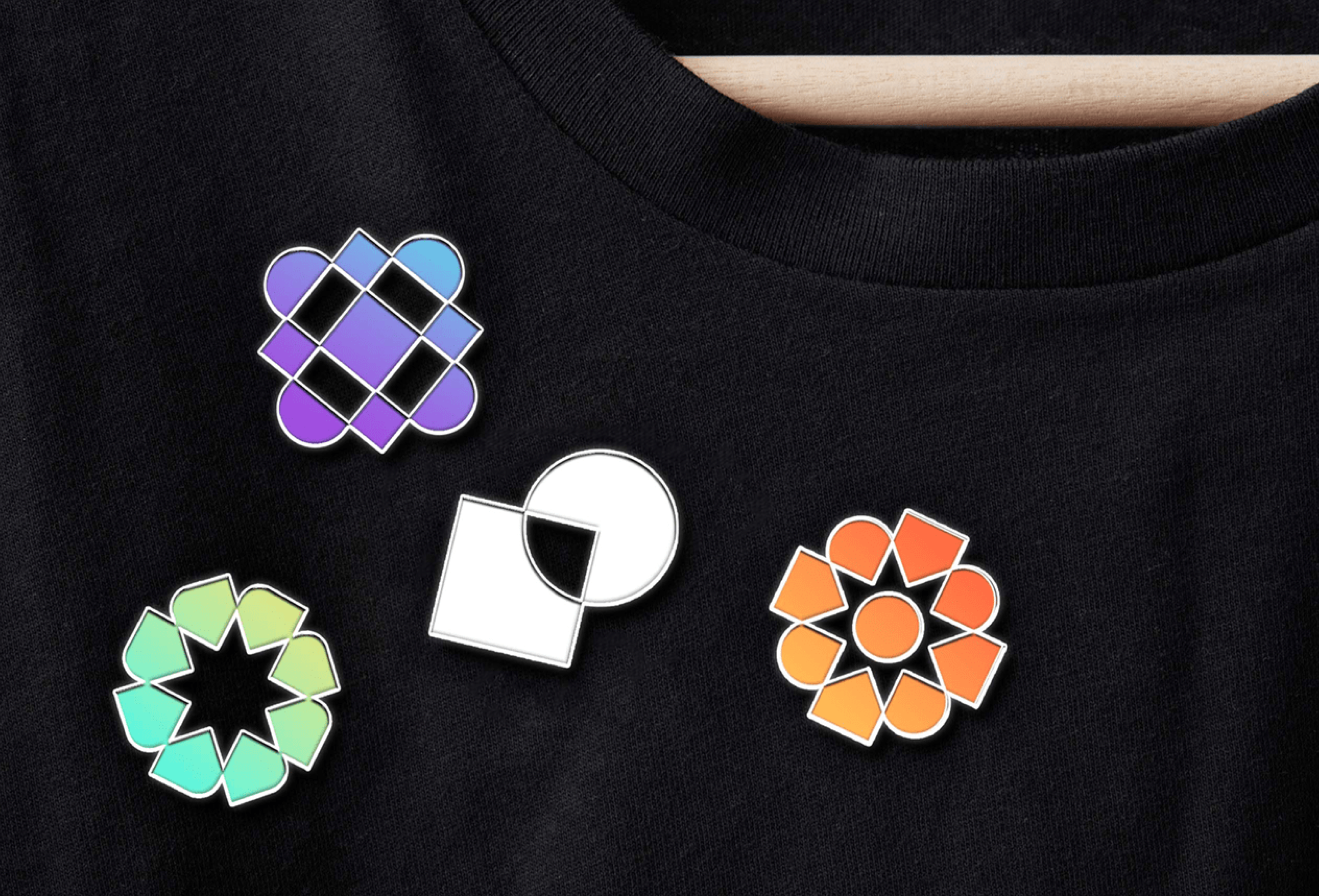
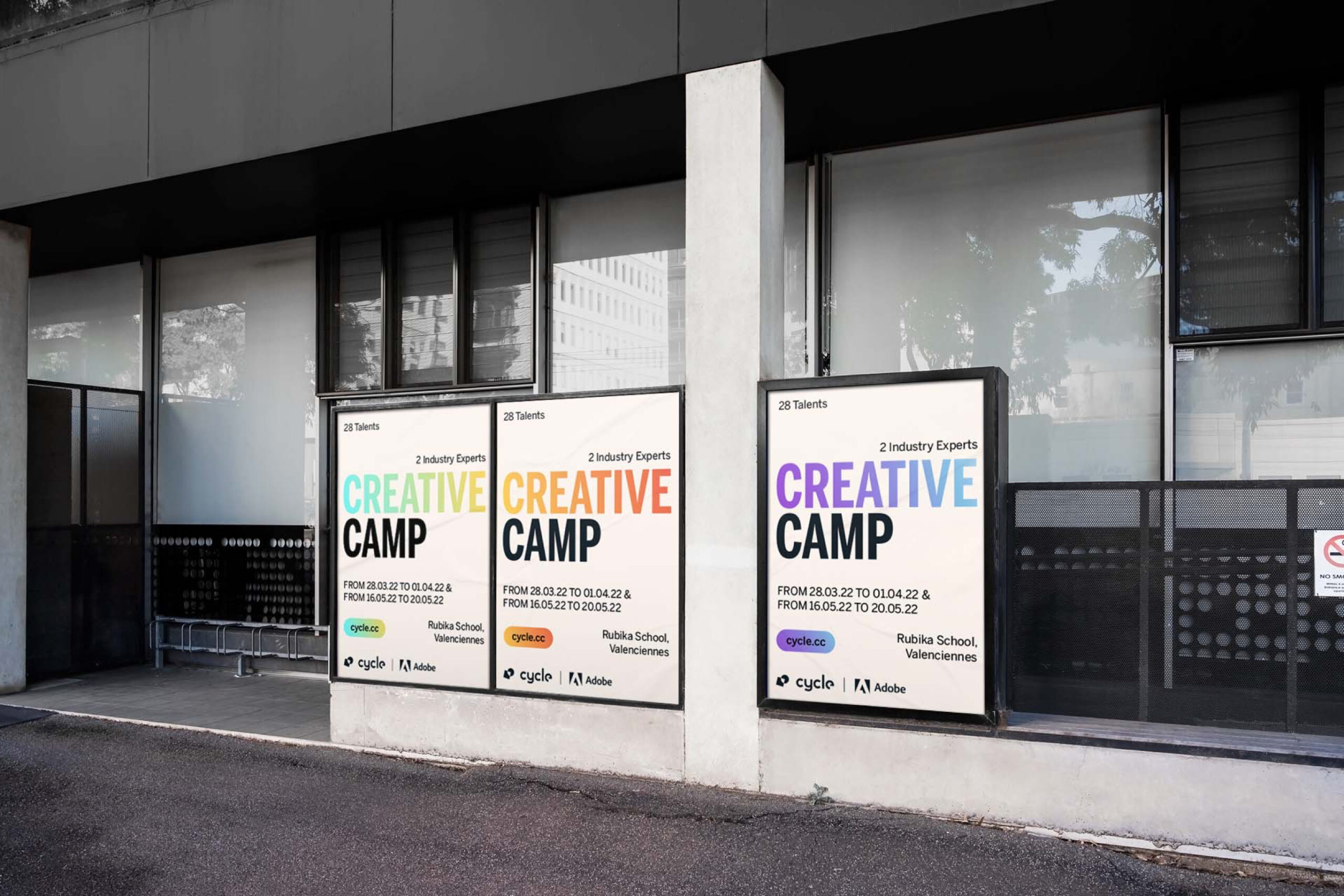
The Cycle symbol represents the collaboration between industry experts and new talent. It is unexpected, exciting and colorful. The different badges represent the stage of evolution of each member of the cycle. It evolves over time until it is an expert. The colors follow each other, respond to each other and work together to create an identity ahead of its time. The typography, Benton Sans perfectly meets the need for personality, impact and modernity around the Cycle.
