21ST
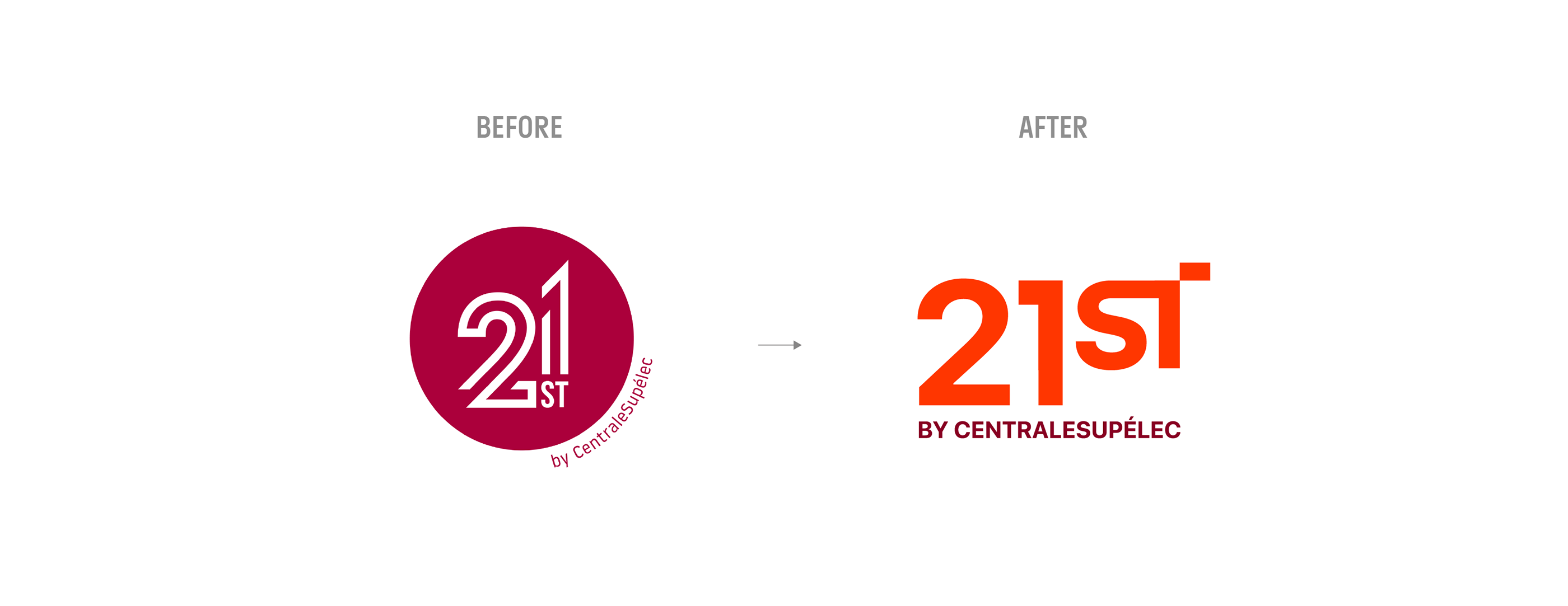
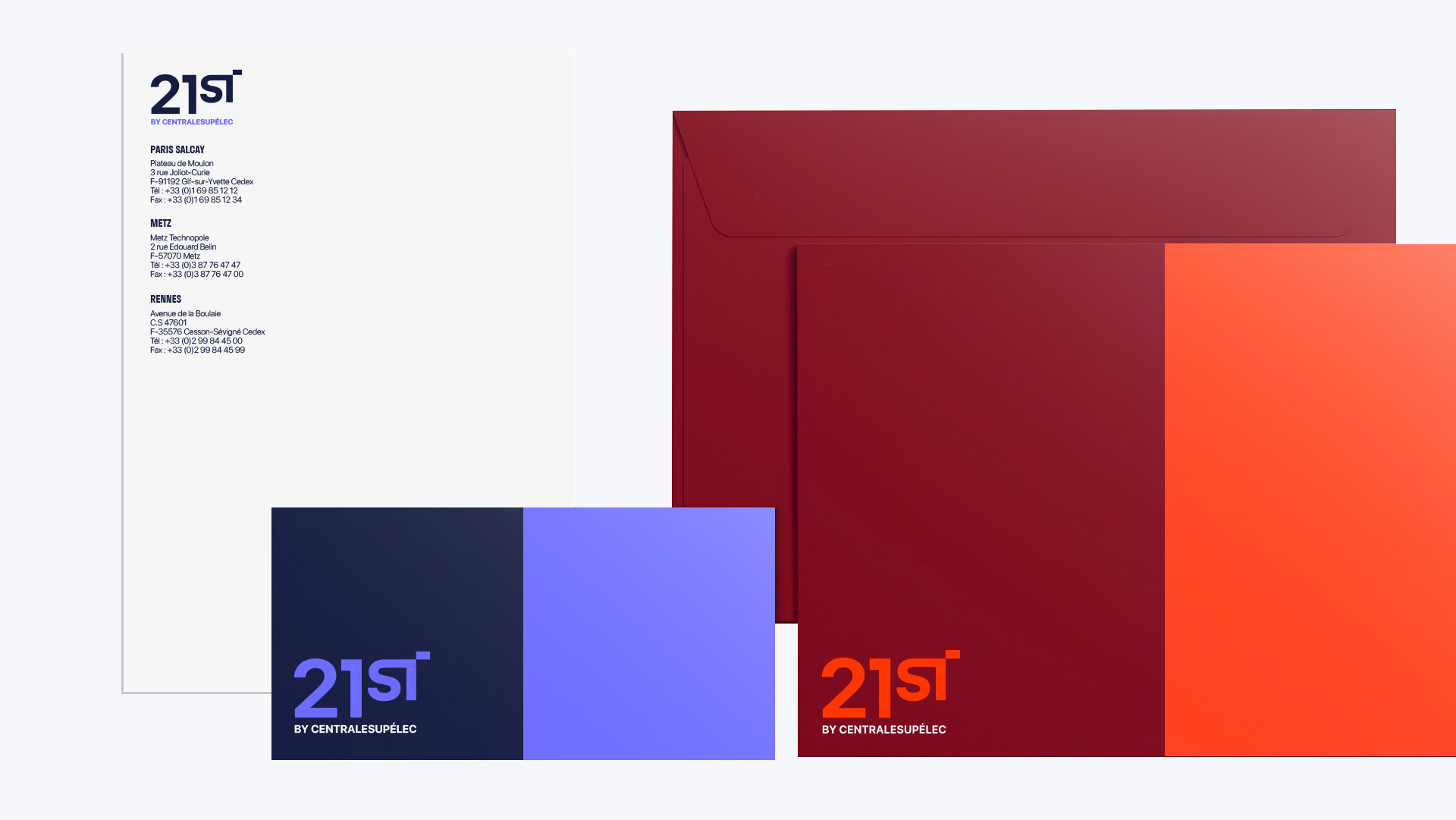
21ST is an incubator born of the collaboration between CentraleSupéléc, the University of Paris-Saclay and Centrale F with the ambition of supporting the most disruptive innovations of the twenty-first century.
Challenge
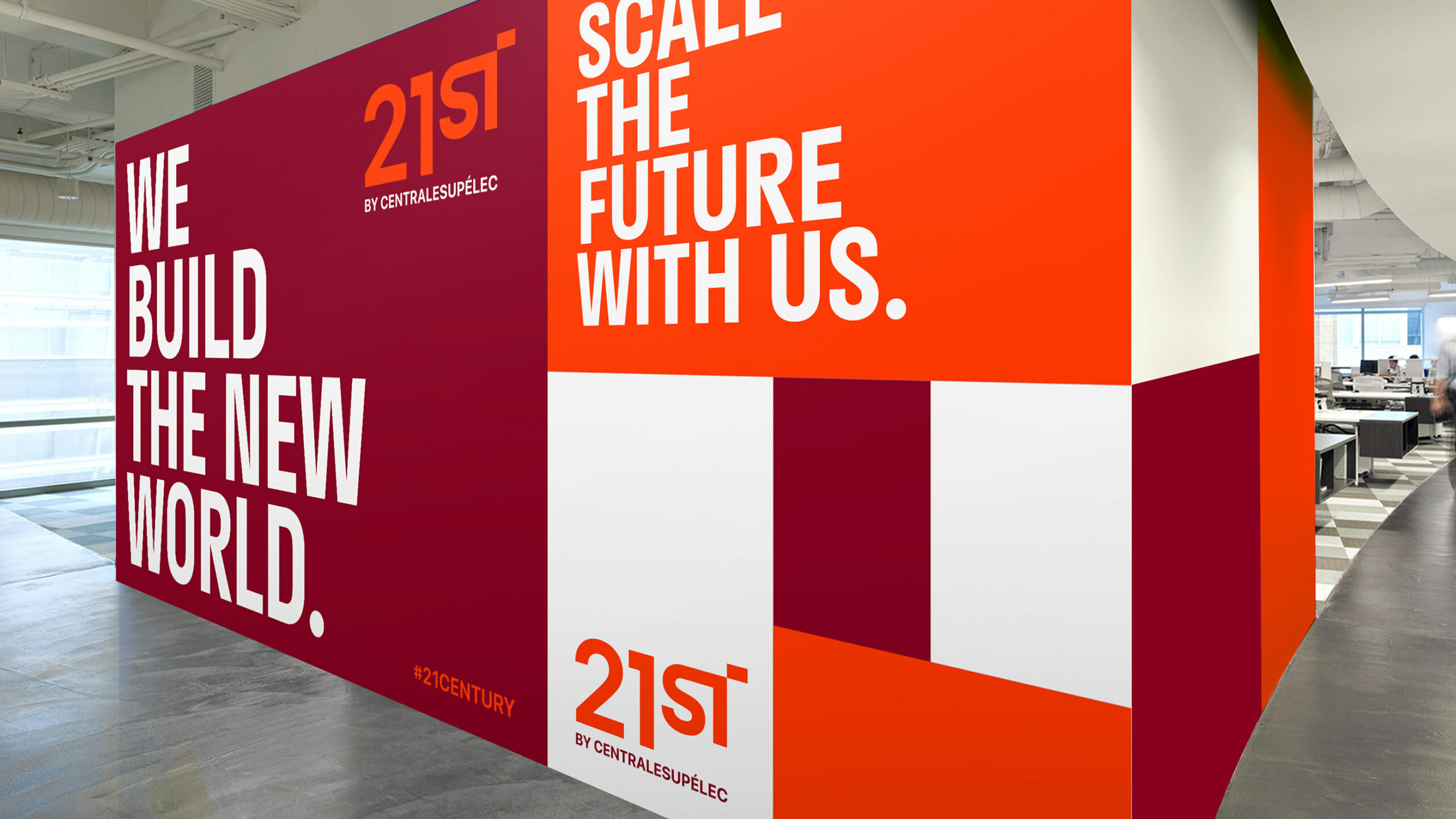
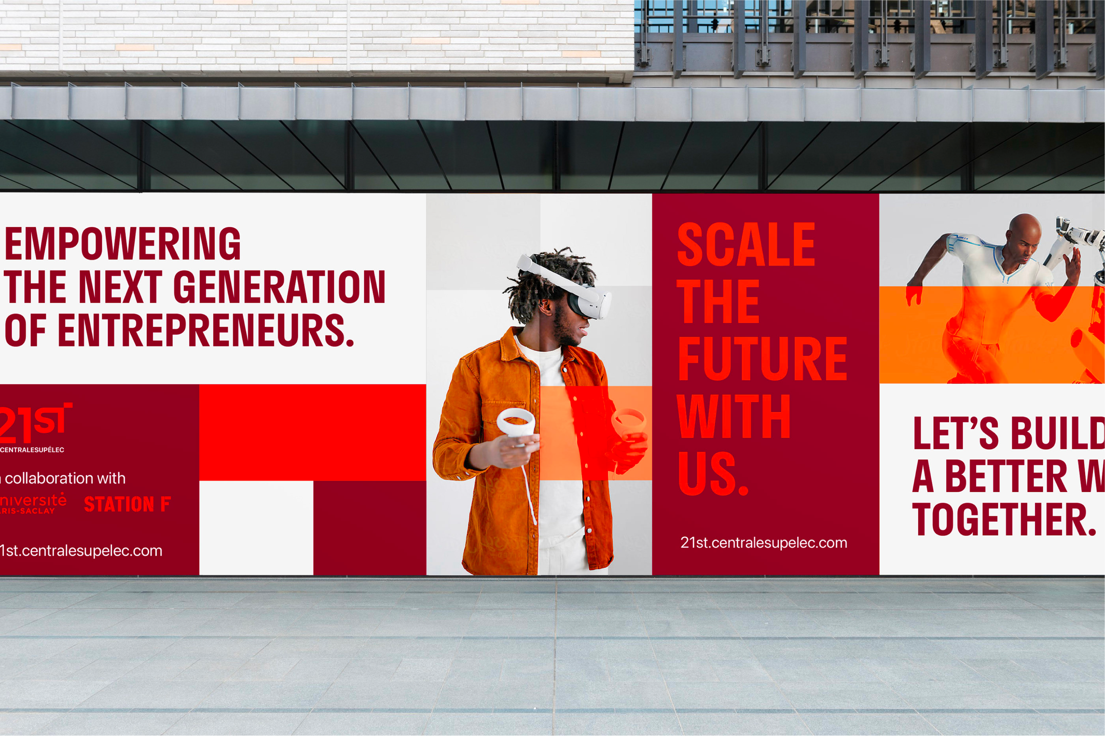
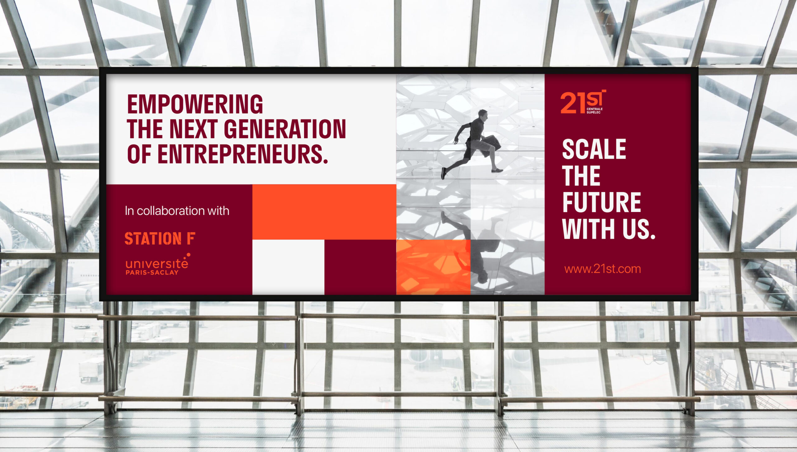
The team in charge of 21ST at CentraleSupéléc contacted me to help them create a visual identity that stands out by its ambitions and its clear positioning. Wishing to help ambitious start-ups build the world of tomorrow, the image of 21ST had to reflect a certain assurance. With more and more incubators on the market, 21ST had to differentiate itself through a strong and committed image.
Solution
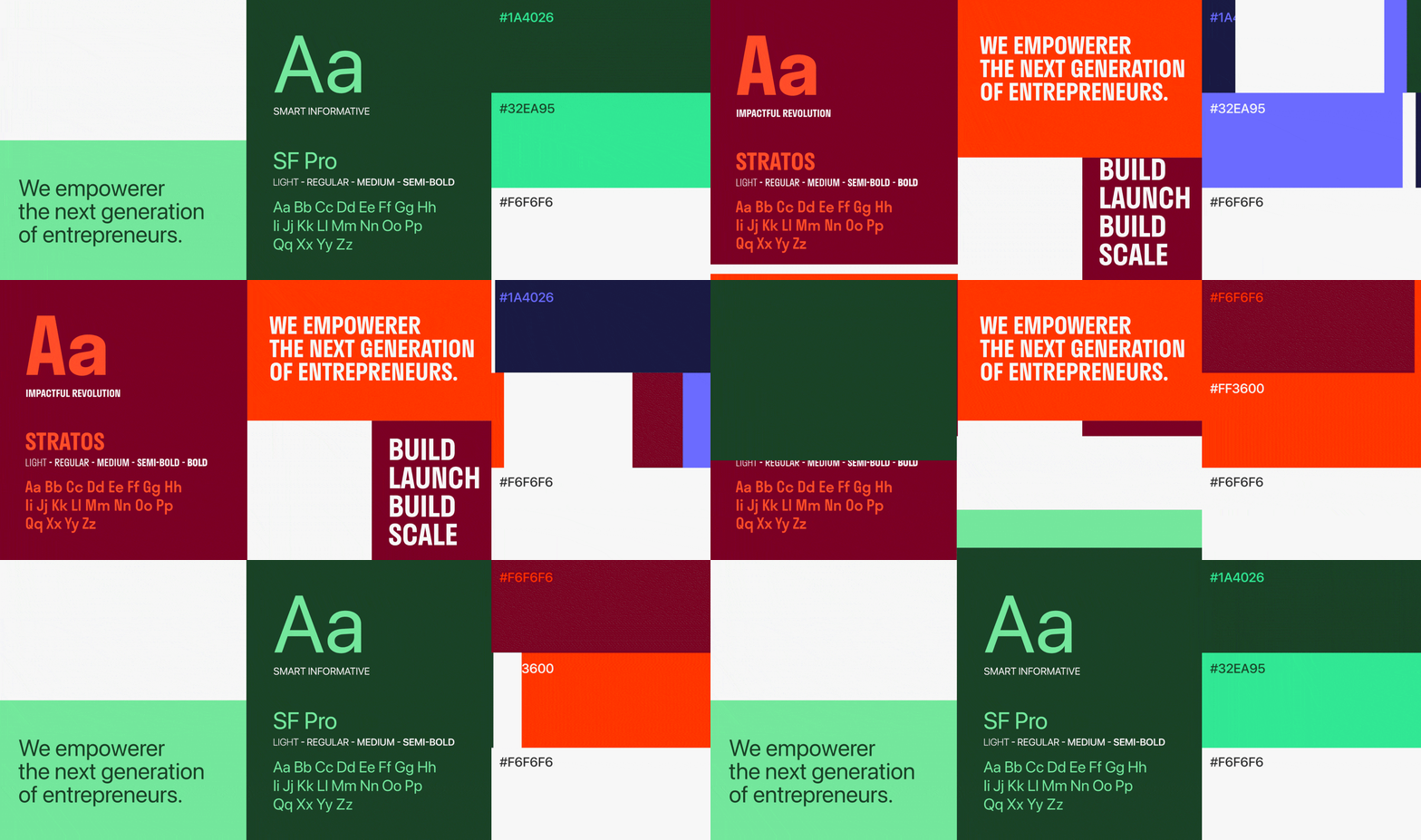
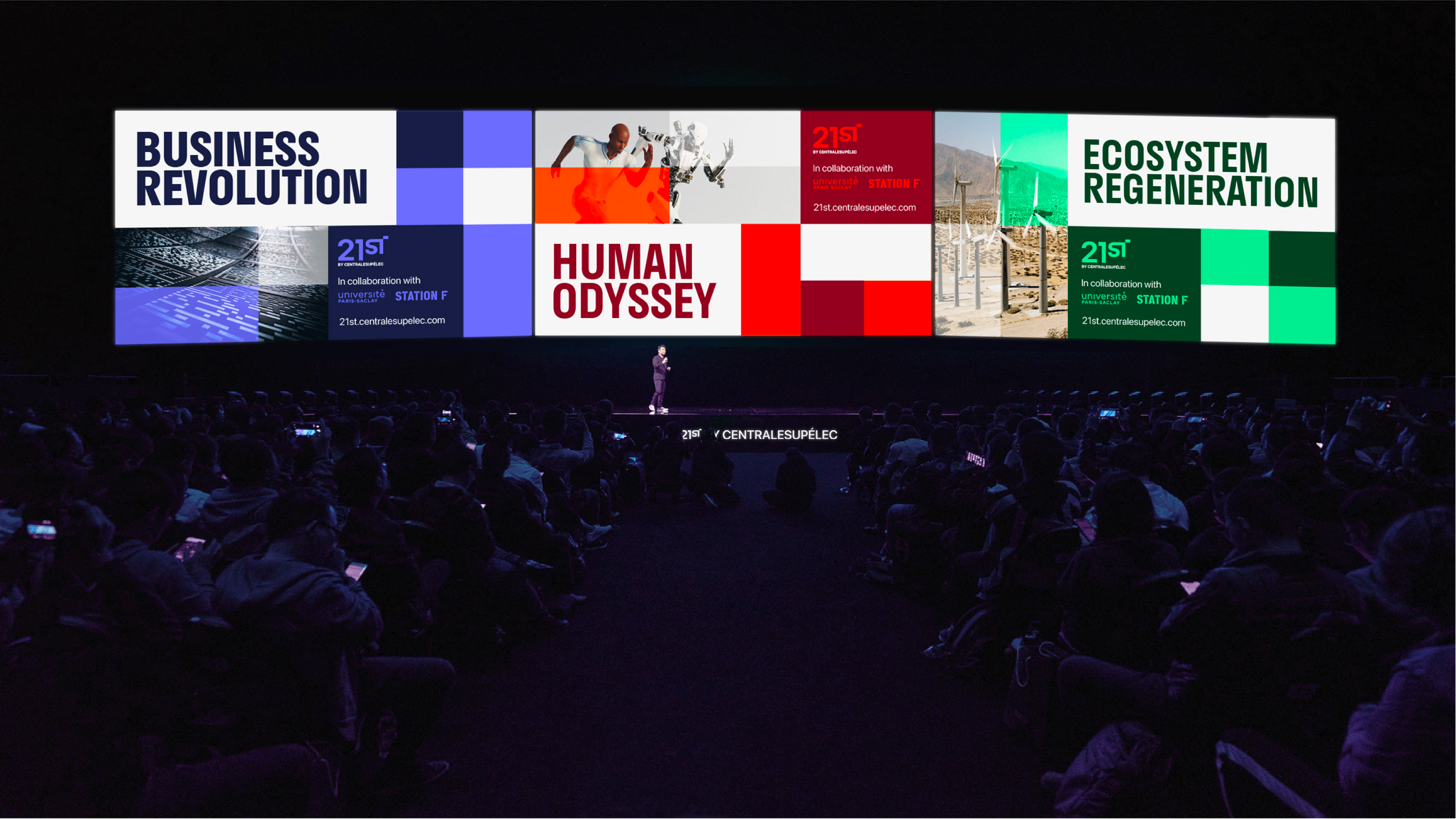
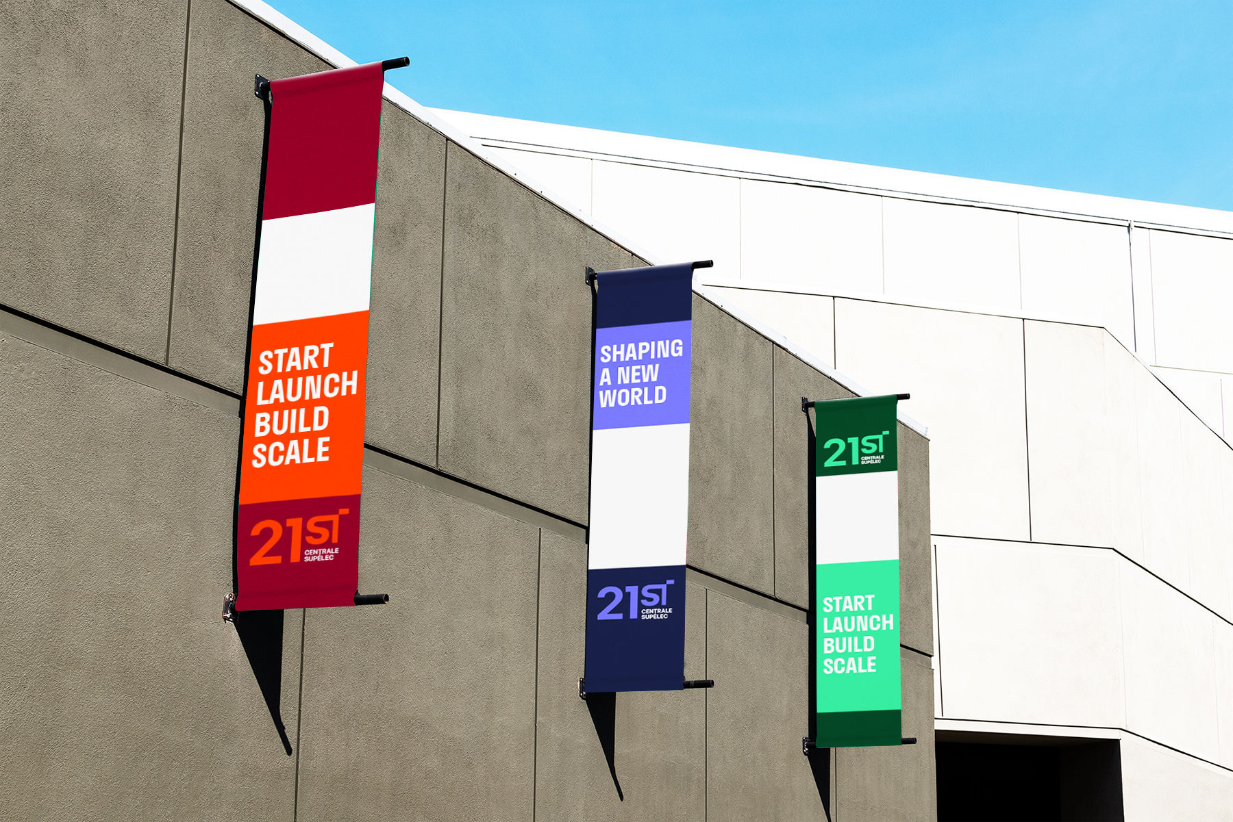
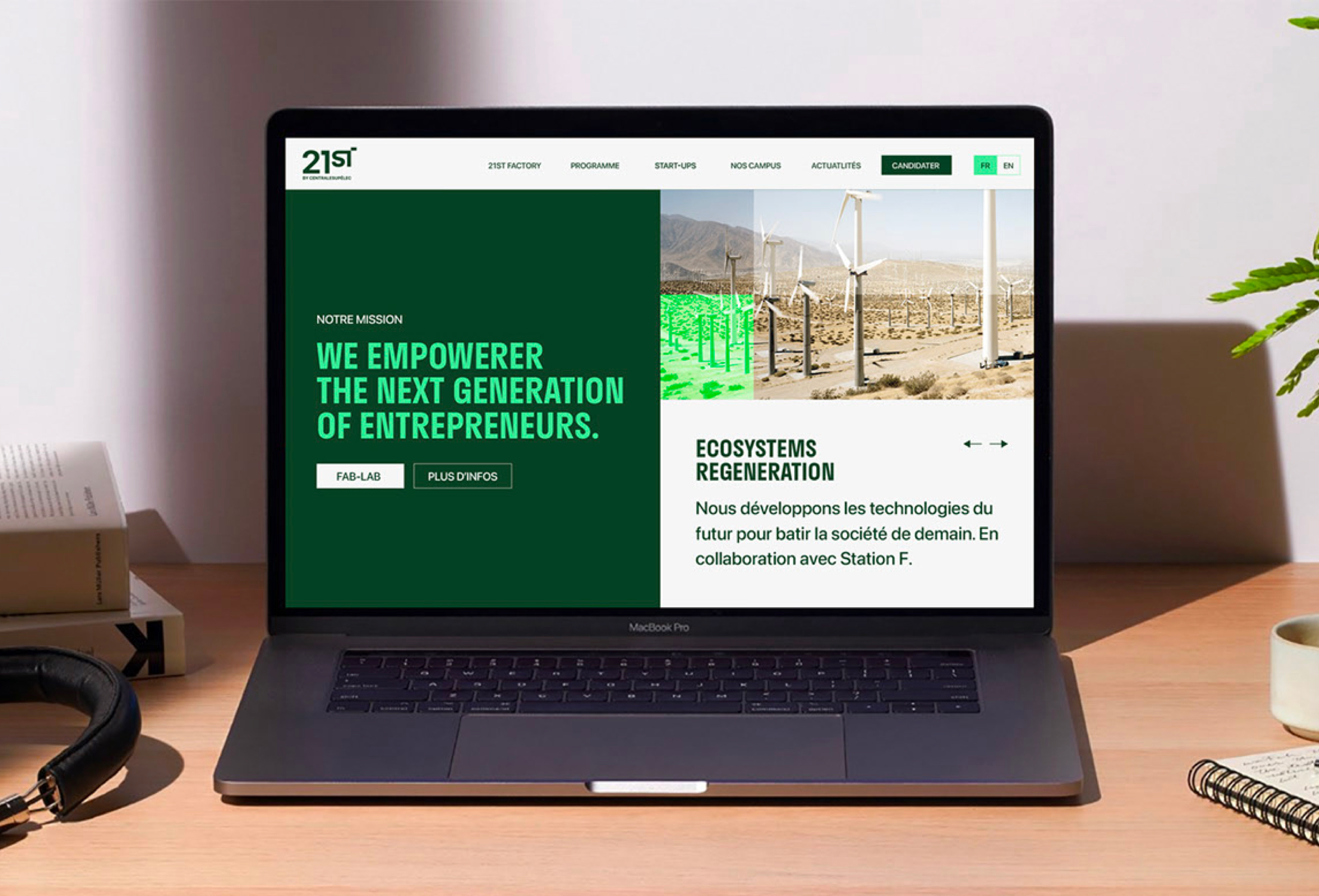
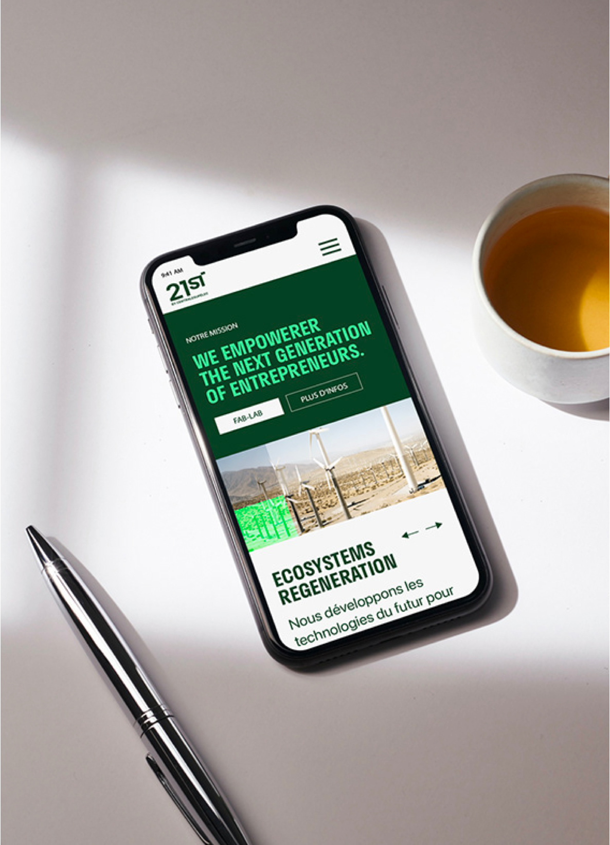
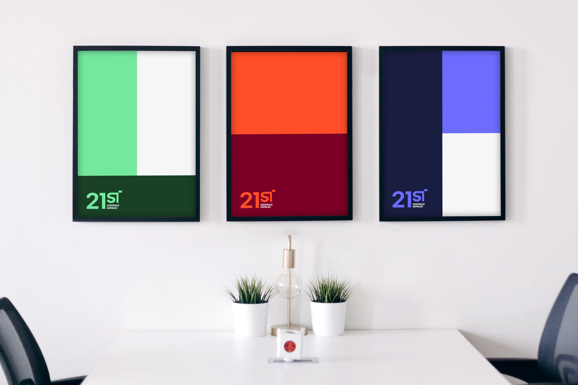
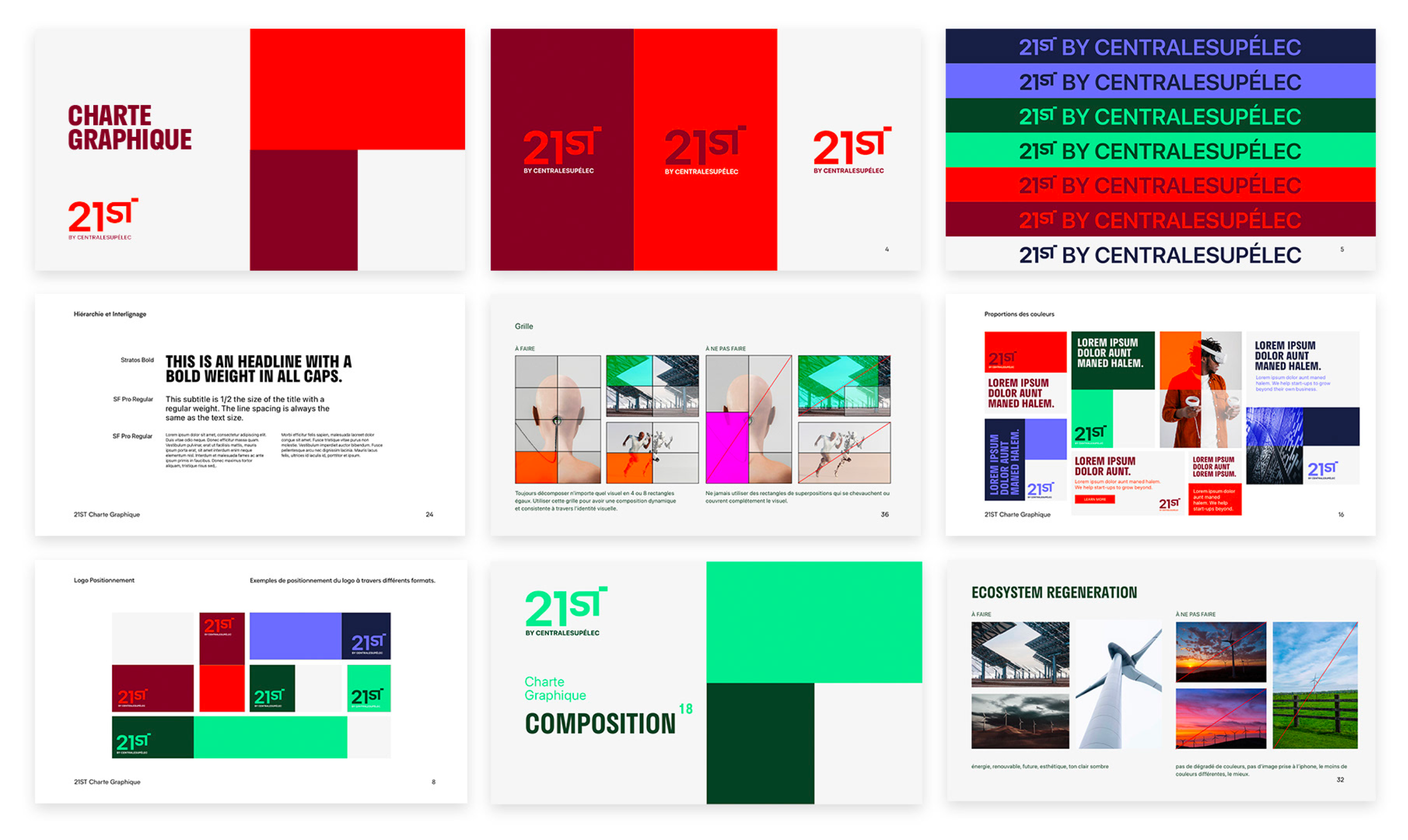
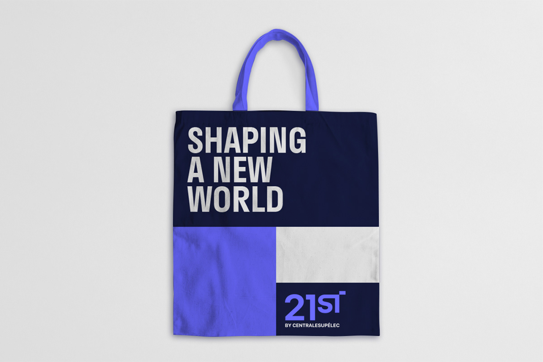
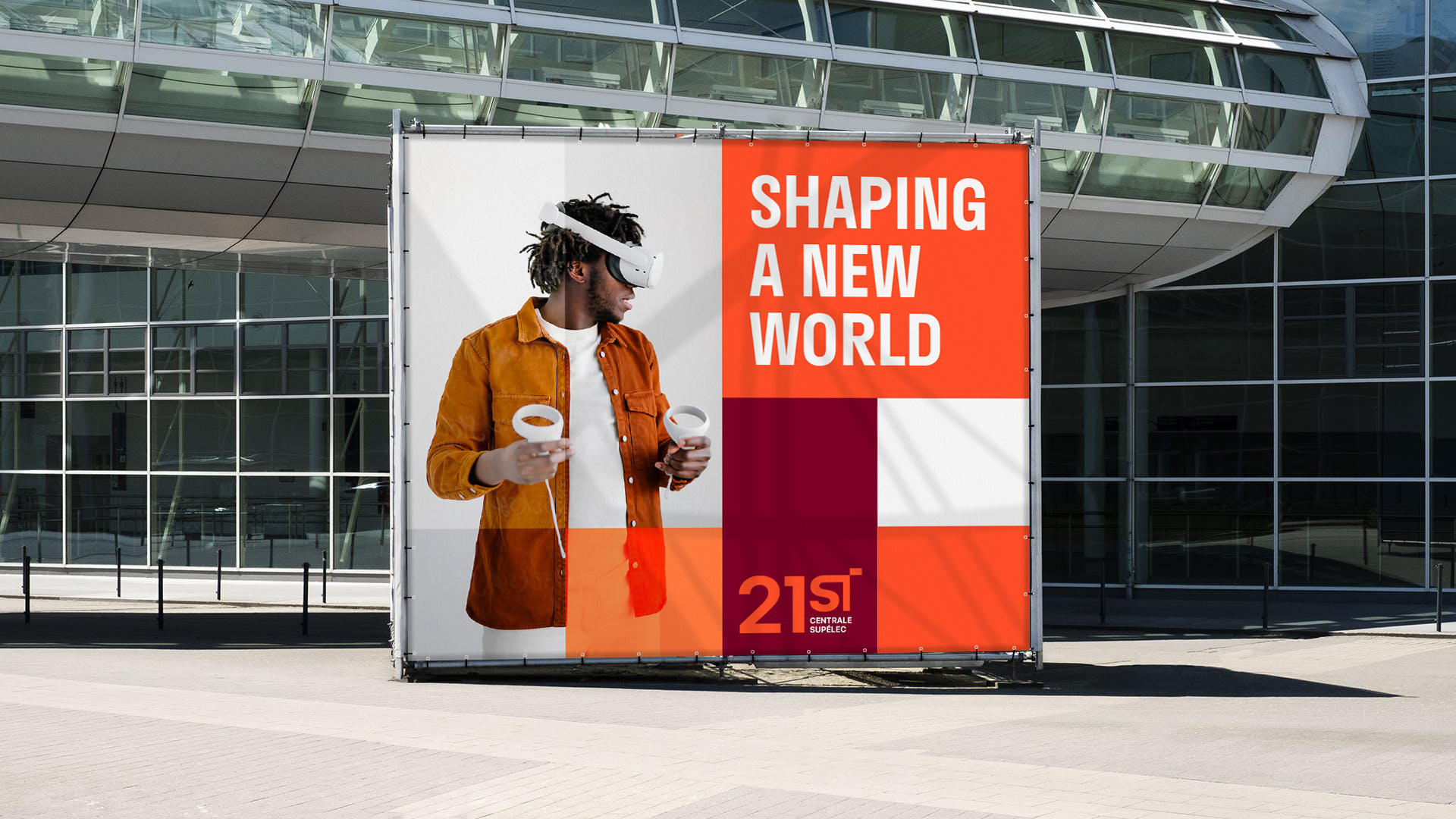
The system had to be flexible according to the different media and the different themes addressed. Human Odyssey in red, Ecosystem Regeneration in green and Business Revolution in blue-violet.
