BRAND IDENTITY
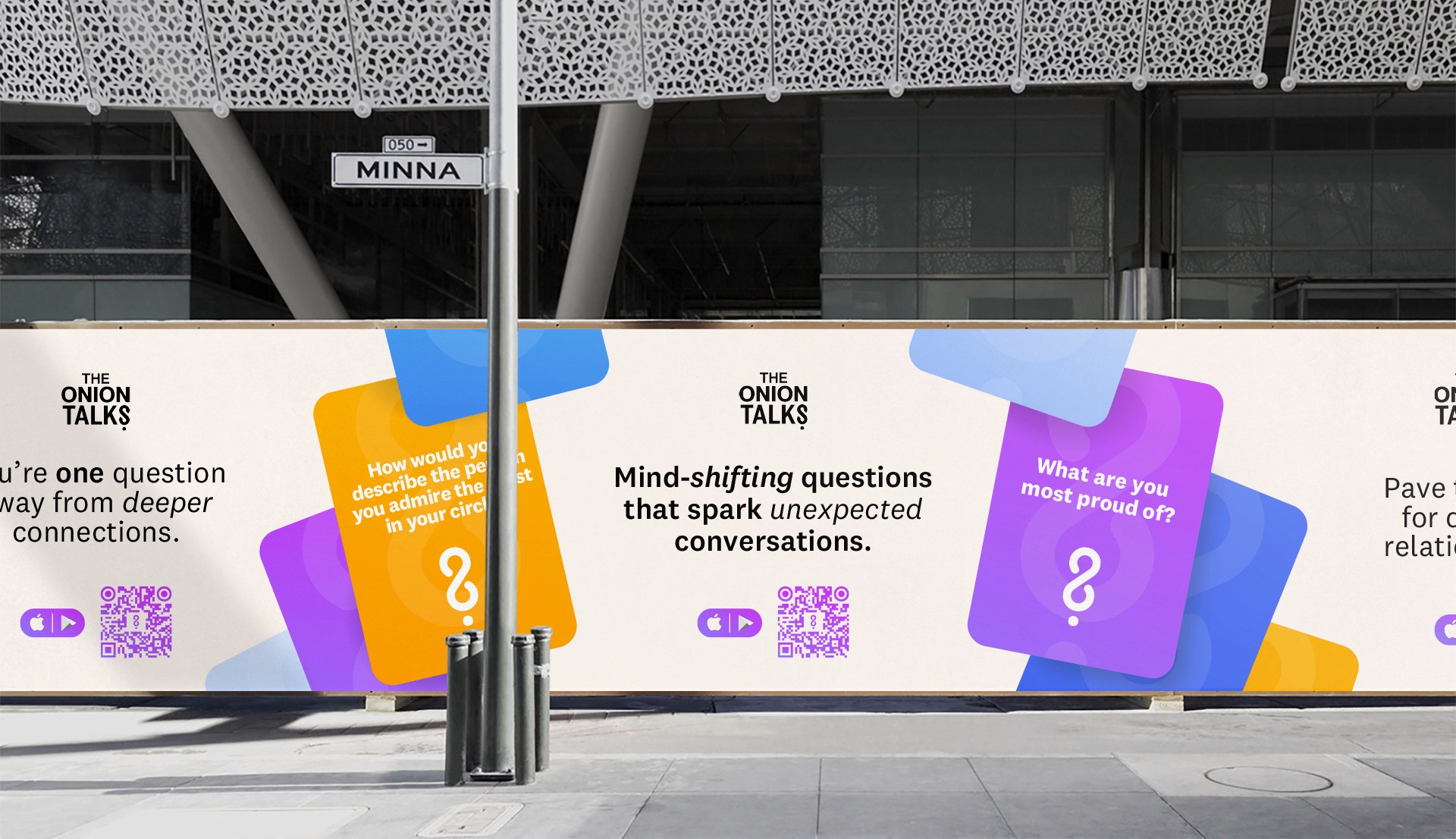
The Onion Talks is an app that deepen human connections and spark self-awareness, one question at a time.
Context
We have discussions every day with ourselves, partners, friends, family, colleagues, or even strangers. But how many times do we really connect with each other? How often do we learn something new about ourselves or the people we care about? How often does our mindset or point of view shift? We've never been so connected, yet so disconnected from each other. That's why we created The Onion Talks.
Challenge
Crafting The Onion Talks brand was a unique challenge—finding the sweet spot where playfulness flirts with seriousness. The task at hand was to create a symbol that not only captivated but also reflected the essence of self-discovery, profound questions, and forging deeper connections. It required a delicate blend of familiarity and uniqueness.
Solution
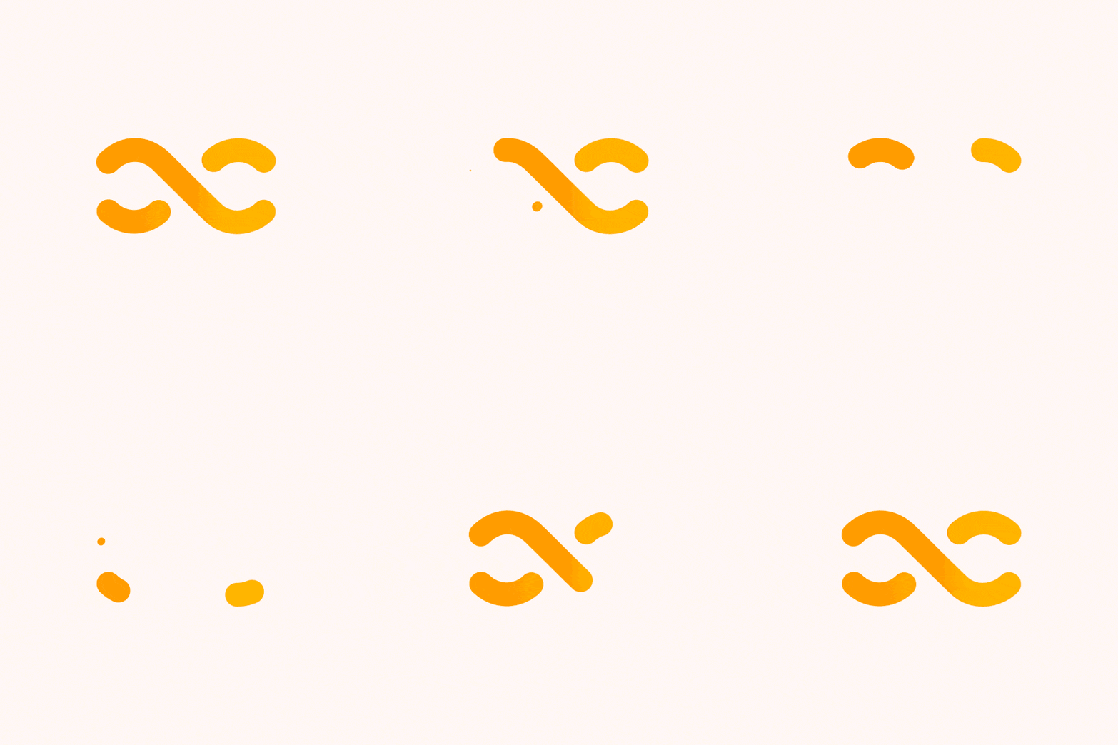
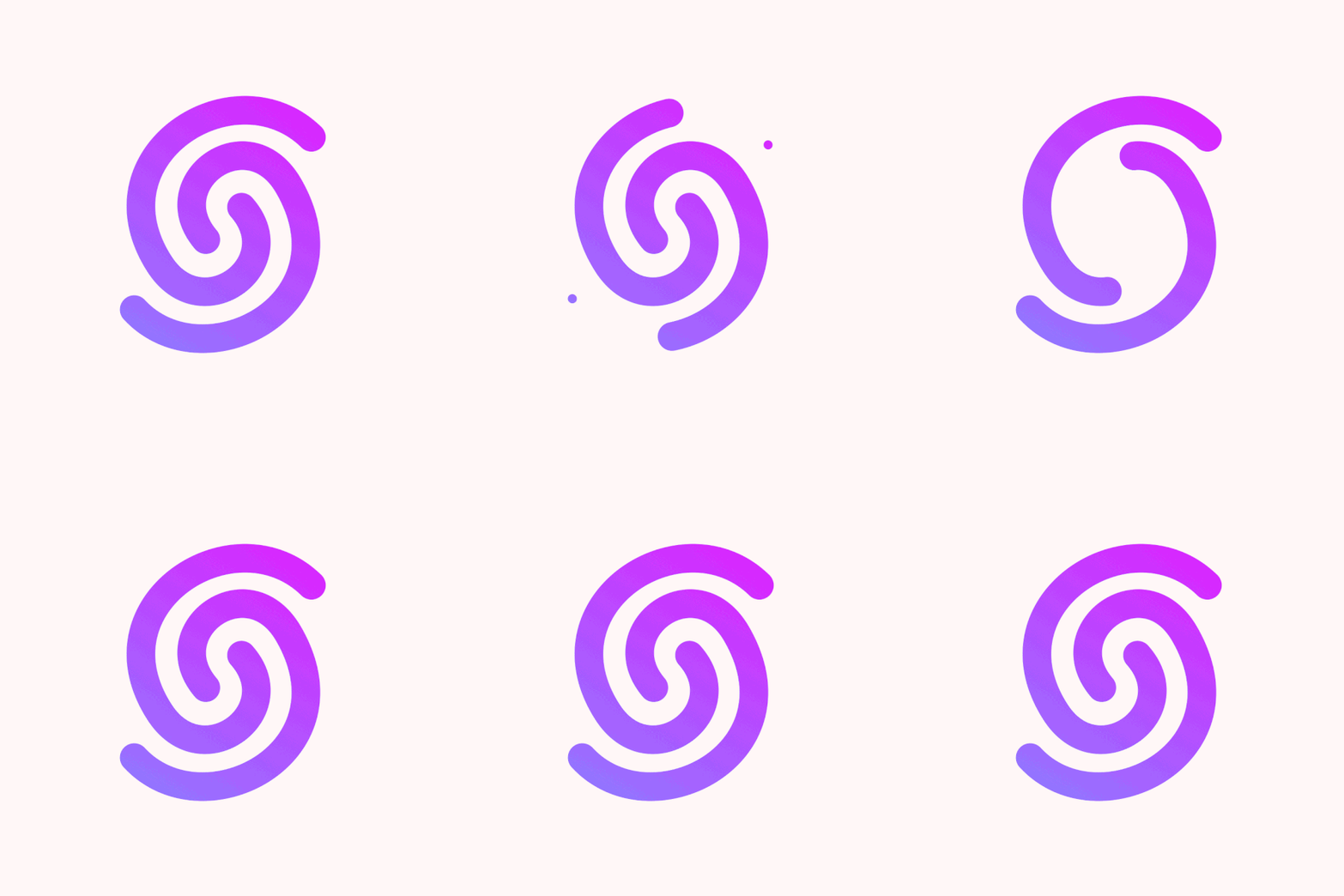
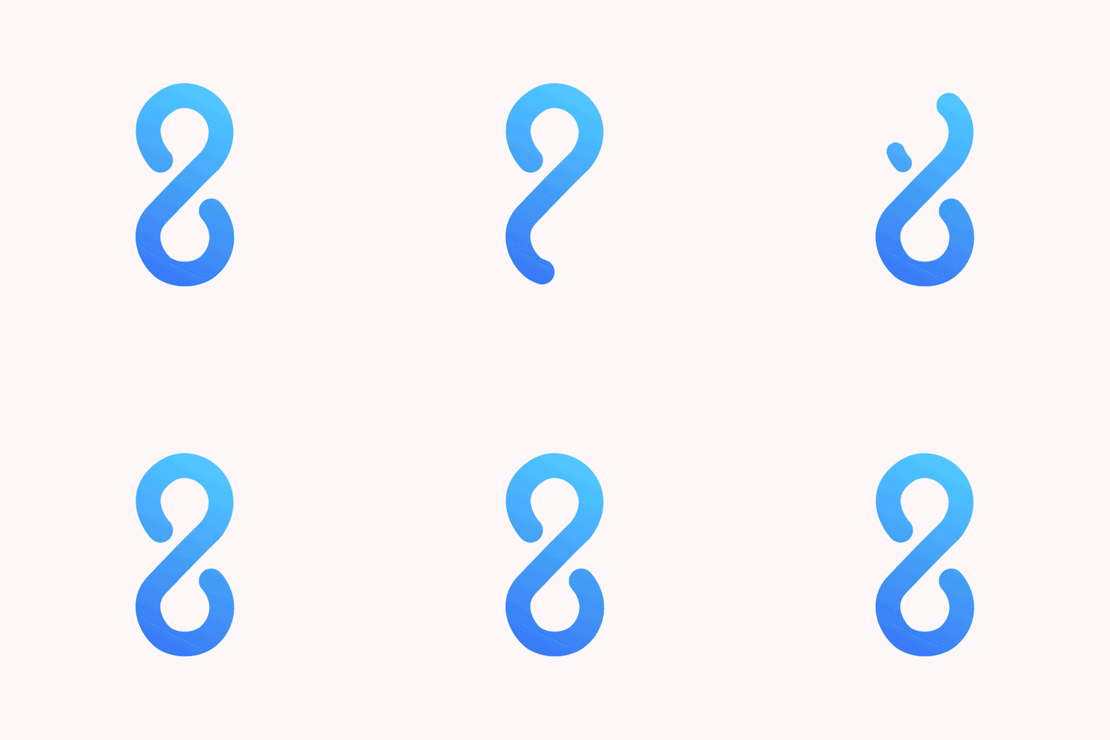
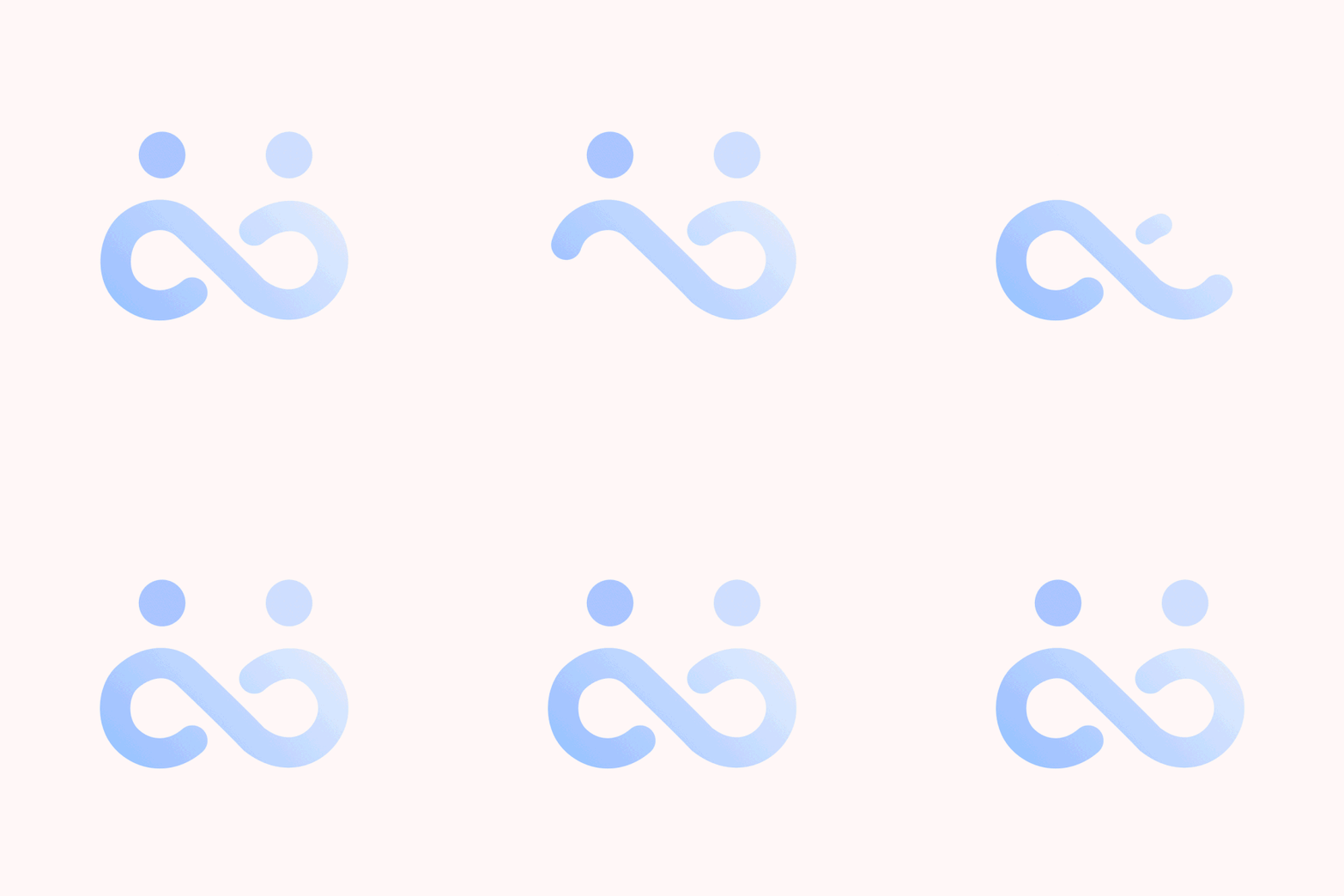
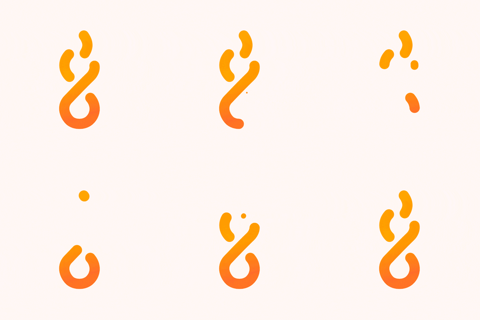
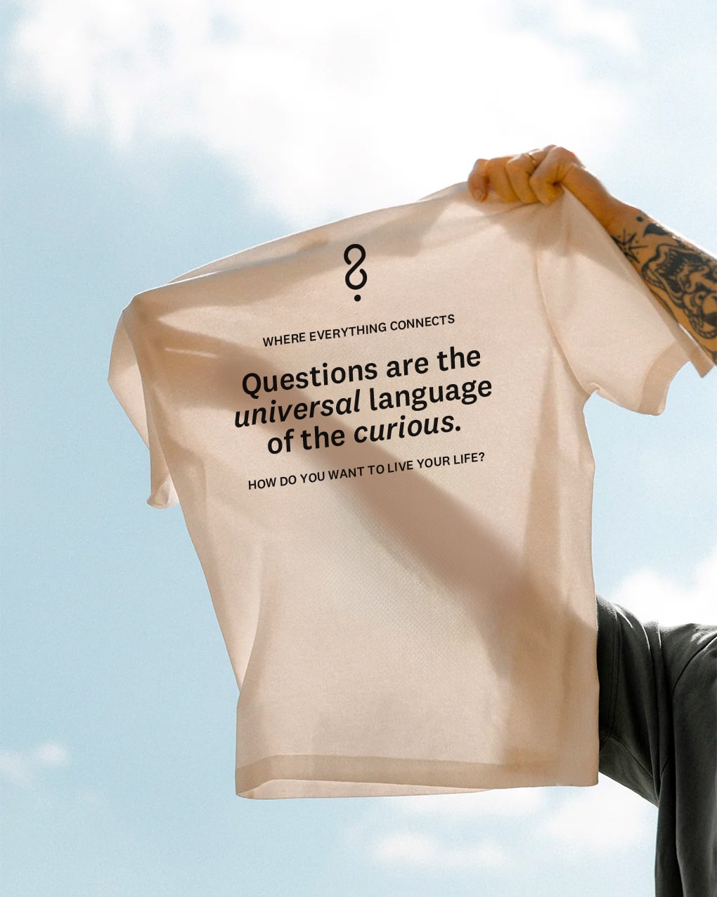
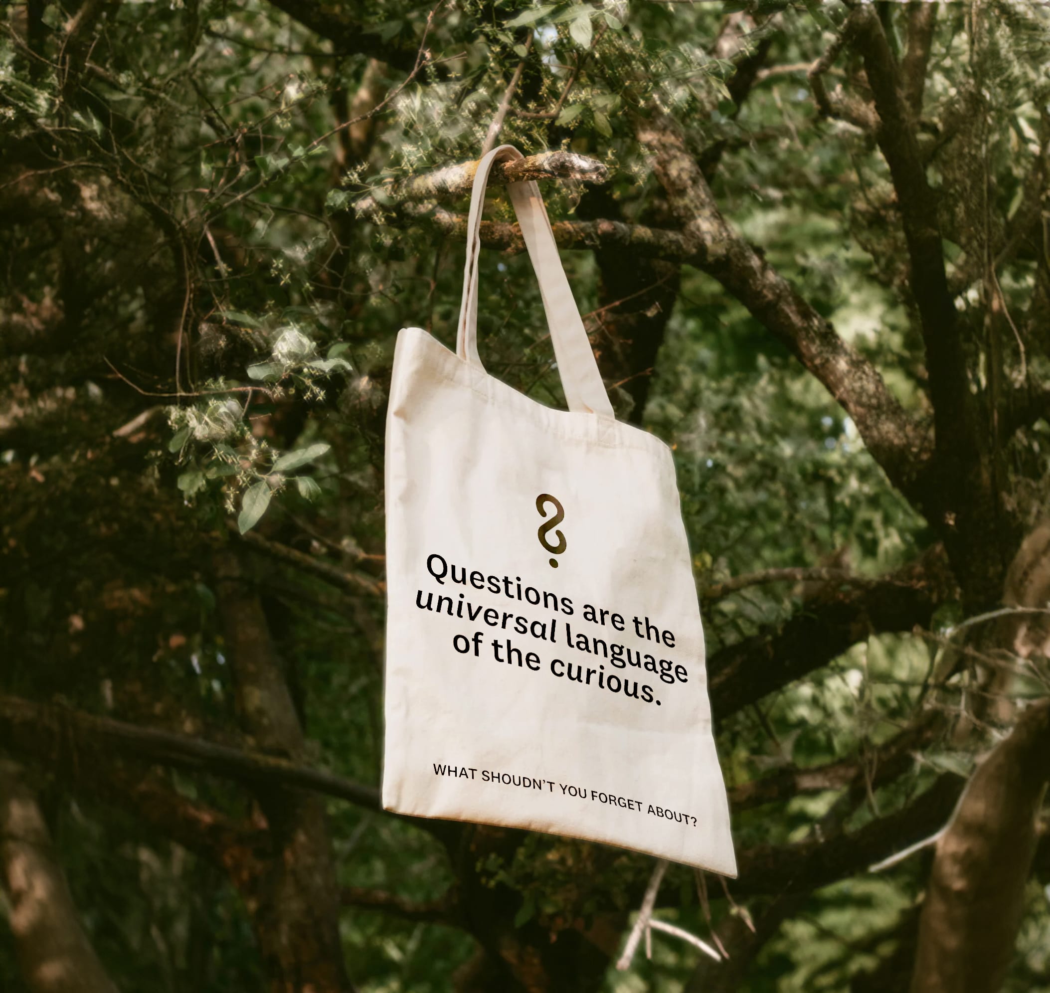
After explorations, I've found a direction answering all of my questions. It started from the question mark, this familiar symbol worldwide known, closing it by a loop representing the infinite nature of questions. Representing that there are no right or wrong answers, only a path to discovery. It's a timeless process that never ends. We've asked ourselves questions since the dawn of time and we'll never stop. I then animated the symbol as a perpetual movement that feels endless.
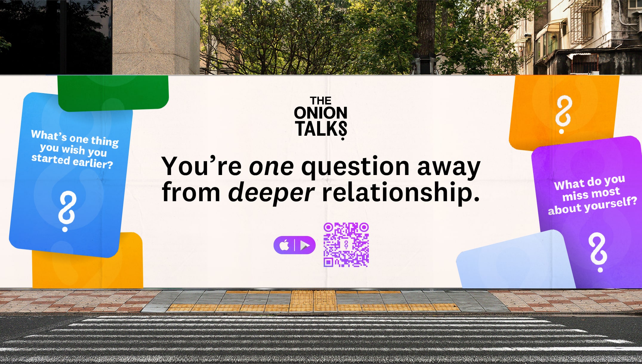
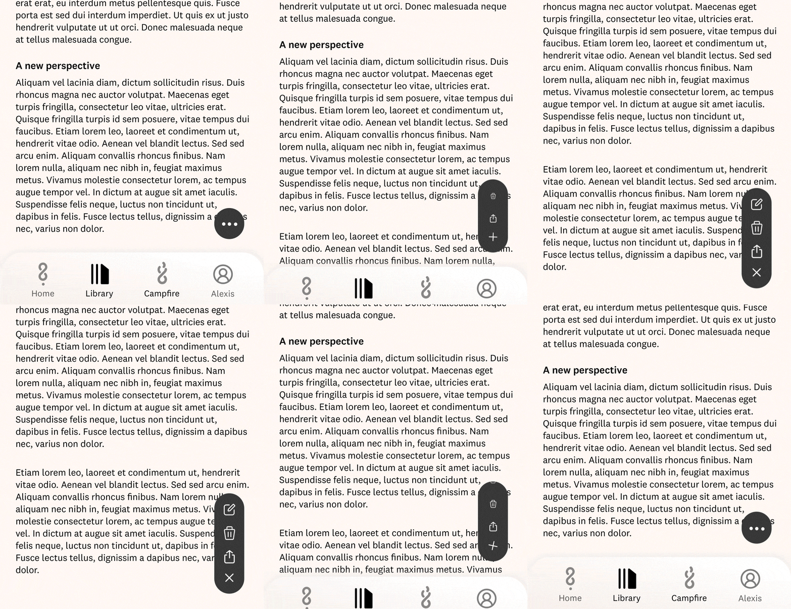
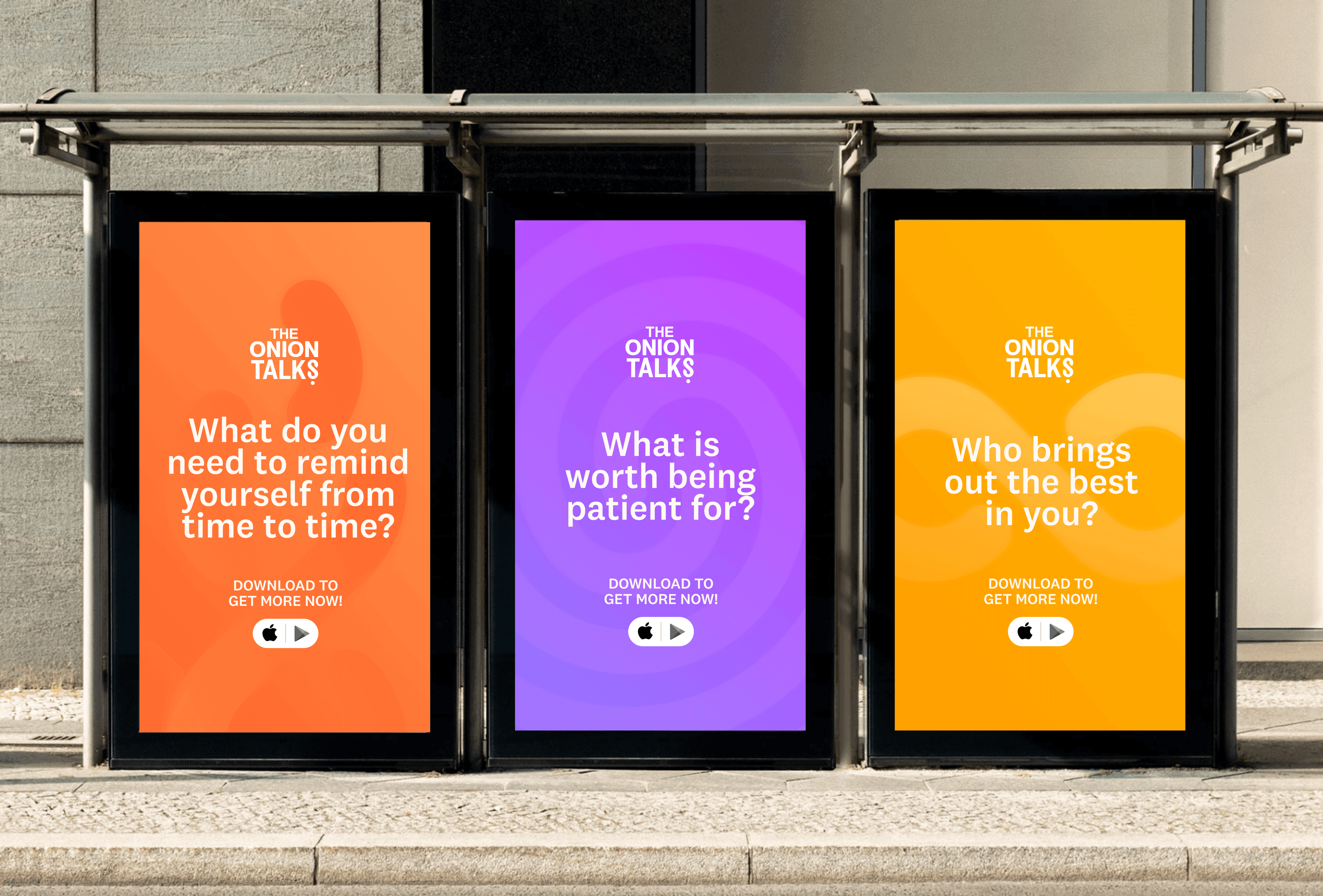
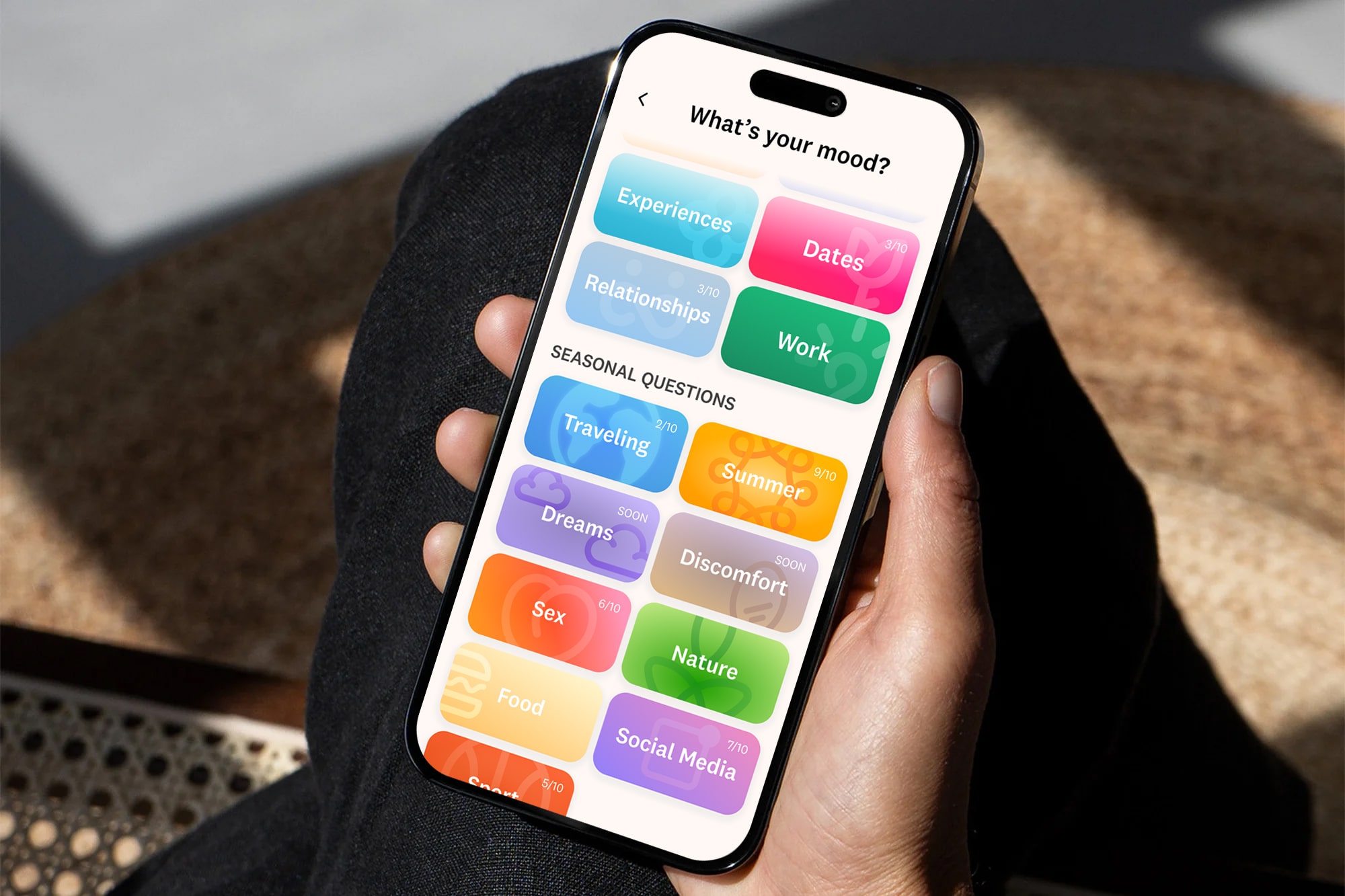
Our colors evoke curiosity, accessibility, and playfulness throughout the user experience. I designed an app that is begging to be used. The overall dominant background color is a light beige to bring back some simplicity and space to breathe.
The typography National 2 from Klim Type Foundry is the perfect blend of character and familiarity. It feels fresh and brings a large flexibility of usages across our different supports.

