ILO STUDIOS
A space where people comeback to the balance between their body and their mind.
Context
ILO exists because modern life has disconnected people from their bodies, from effort, and from each other. In a world full of noise, it has become hard to slow down. Ancient practices like sauna, ice baths and breathwork are pathways back to health, to presence, to yourself.
The wellness industry doesn't help. It's saturated with luxury spa aesthetics, biohacking jargon and hyper-performance culture. ILO needed a brand that stood apart from all of it grounded not in aspiration or optimization, but in something more honest: the idea that growth, presence and resilience are practiced, not purchased.
The challenge was finding a voice that acknowledged the difficulty of the experience without making it sound punishing. A brand that could say "this will be hard" and make you want to show up anyway.


Challenge
The wellness industry is full of clichés. Luxurious spa aesthetics. Biohacking jargon. Hyper-performance fitness culture. ILO needed to stand apart from all of it.
The challenge was to build a brand that reframes discomfort not as something to avoid, but as something worth seeking. A space where growth, presence and resilience are practiced, not purchased. Where the experience is honest about being hard, and the brand is honest about that too.
The difficulty was tonal. How do you acknowledge that ice baths feel brutal and saunas push your limits, without sounding punishing or exclusionary? How do you say "this will be uncomfortable" and still make people want to walk through the door?
The Idea
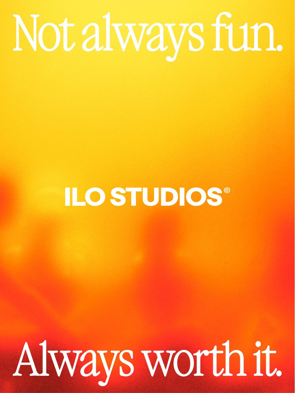
We built the entire identity around one truth: it's always worth it.
Not a tagline. Not advice. A statement. It tells the truth without explaining itself. It implies that the experience is intense, sometimes uncomfortable, but that you always leave feeling like it was worth it. It balances honesty with reassurance, effort with reward.
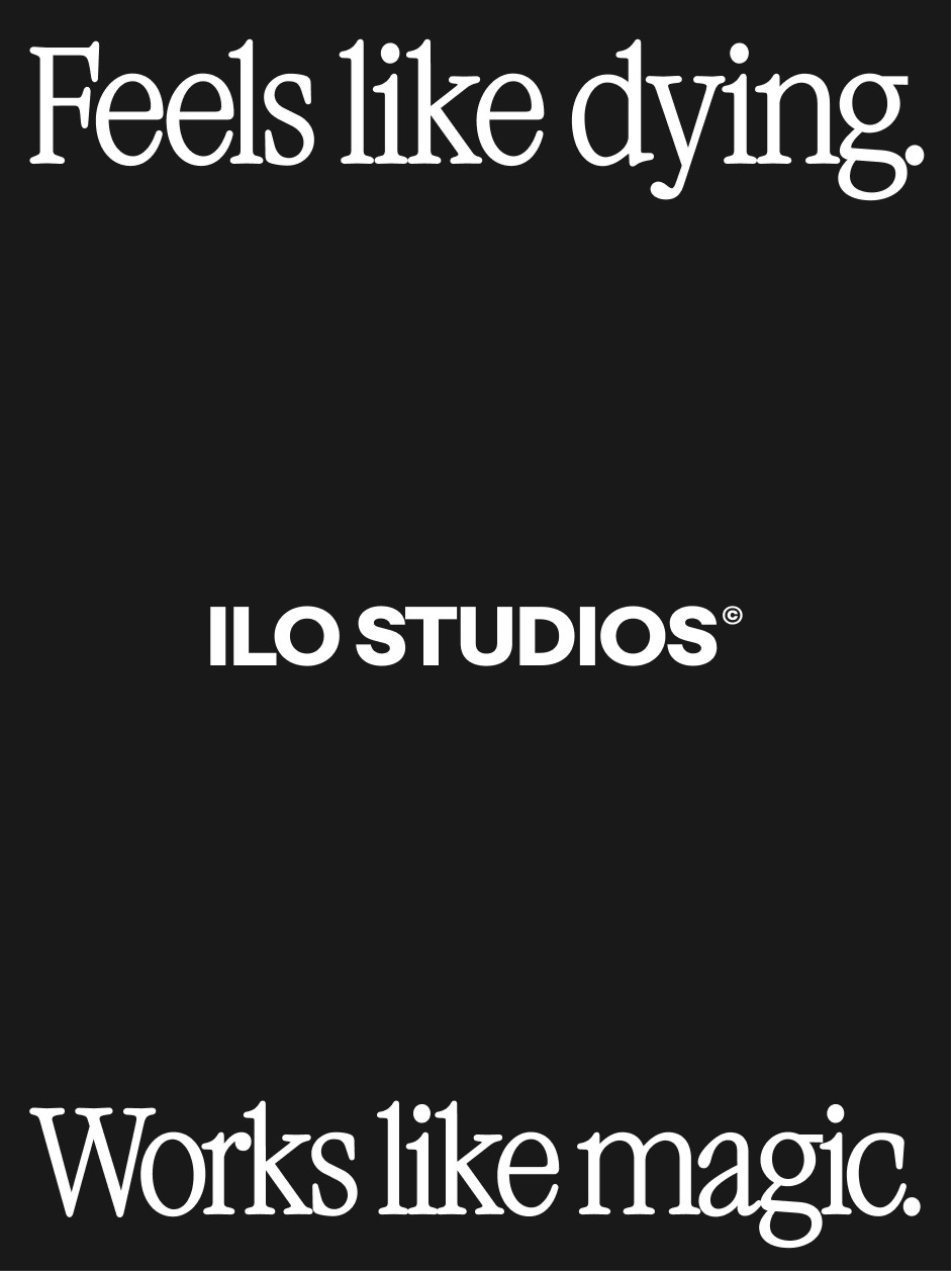
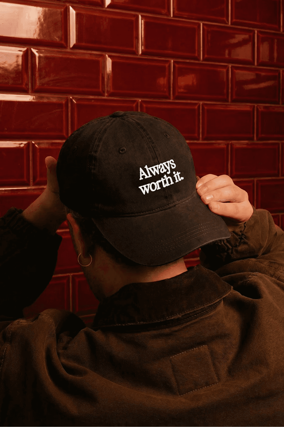
From this central idea we developed a verbal system built on contrast and candor: "Not always fun." "Feels like dying." "Works like magic." "Your stress leaves before you do." The kind of lines the wellness industry would never use. ILO does, because it respects its audience enough to tell the truth.

The Identity
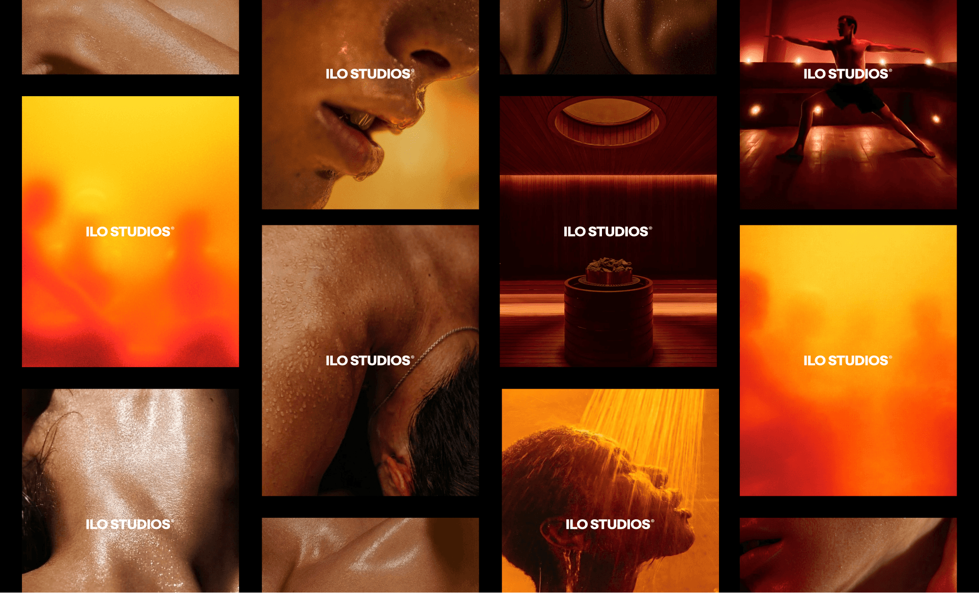
ILO is a space defined by contrast. Heat and cold. Tension and release. Resistance and reward. The visual identity translates that duality into every decision.
Typography. VC Garamond Condensed anchors the identity in something ancient and elemental. It connects to the Roman and Nordic bathing traditions that inspired ILO's practice, while feeling immediate and contemporary at scale, on signage, billboards and across the physical space.
Color. A gradient palette moving from deep amber through burnt orange to warm yellow captures the sensation of heat itself. It is visceral before it is aesthetic. Against black, it creates the same contrast the brand is built on: warmth and intensity, comfort and edge.
The heatmap. Rather than showing a specific person in a specific body, we developed a thermal visual language that abstracts the human figure into color and warmth. You see silhouettes, movement, presence, but not a face, not an age, not a body type. The effect is that anyone looking at ILO's imagery can picture themselves inside the experience. It leaves room for imagination. It suggests rather than shows, which mirrors how the brand communicates: implying the intensity without spelling it out.
Photography. Where we do show the real experience, the direction is close, warm and human. Steam on skin. Light through water. The photography avoids the clinical distance of most wellness imagery. You feel the heat. You feel proximity. It puts you inside the experience rather than observing it from the outside.
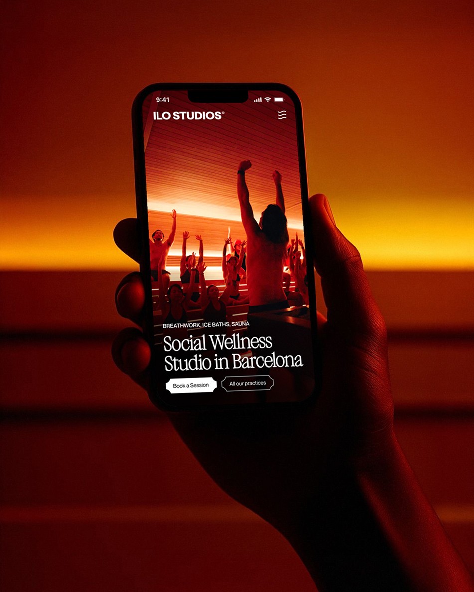
System. The brand extends across membership cards, merchandise, outdoor advertising, digital and the physical studio environment, from the illuminated signage above the entrance to the embroidered towels inside. Every touchpoint reinforces the same idea: this place doesn't perform wellness. It practices it.