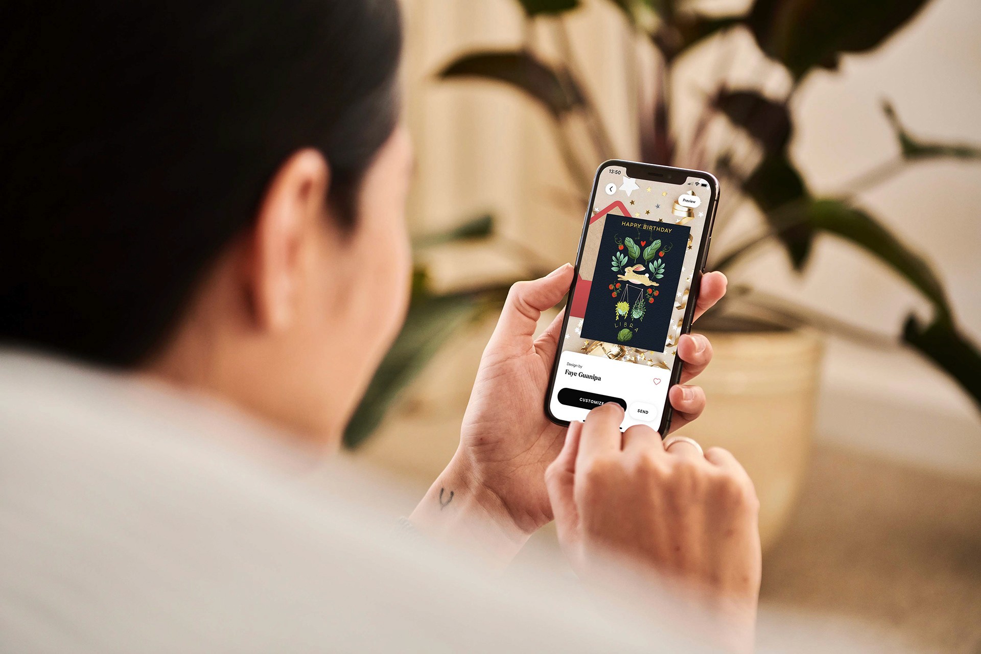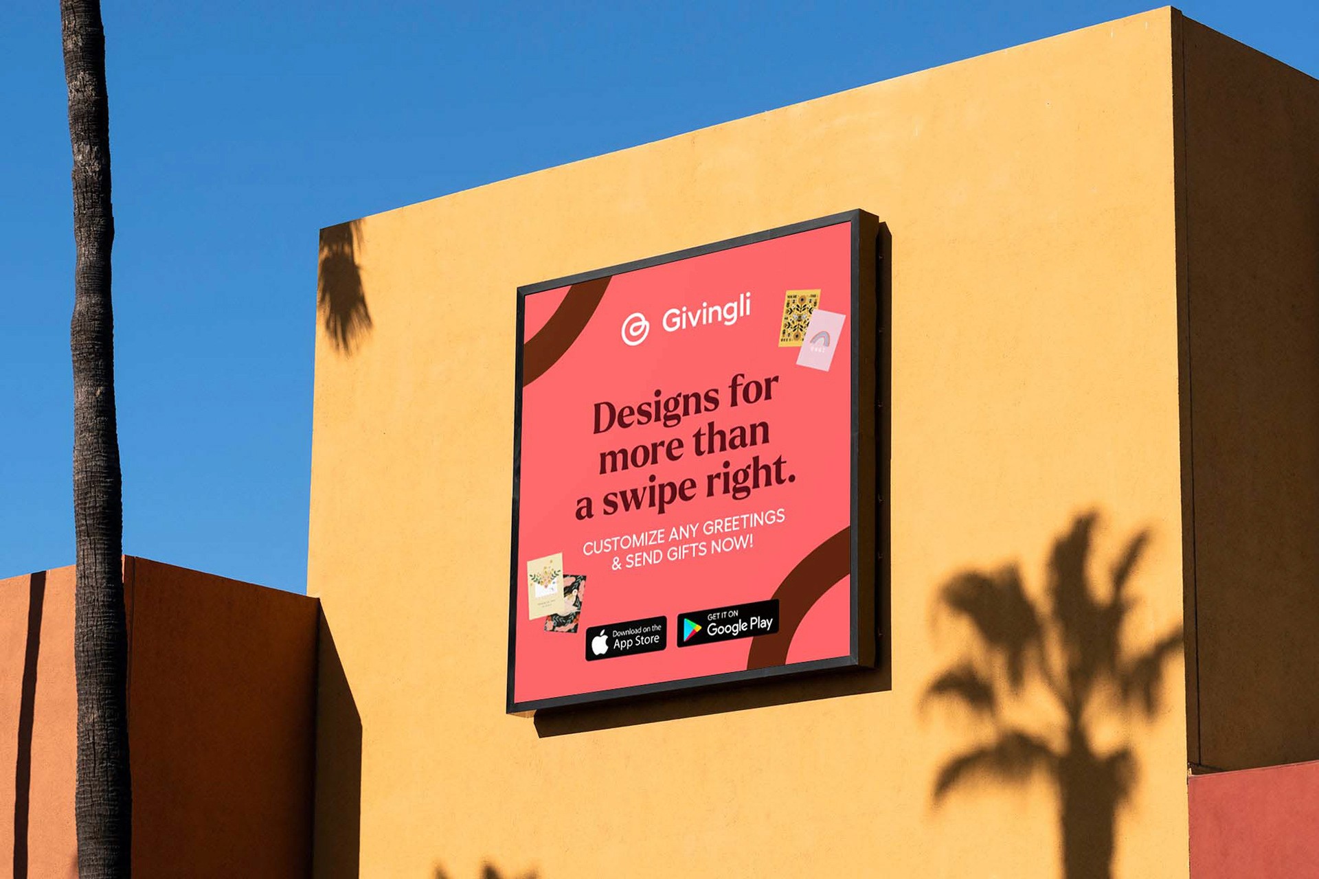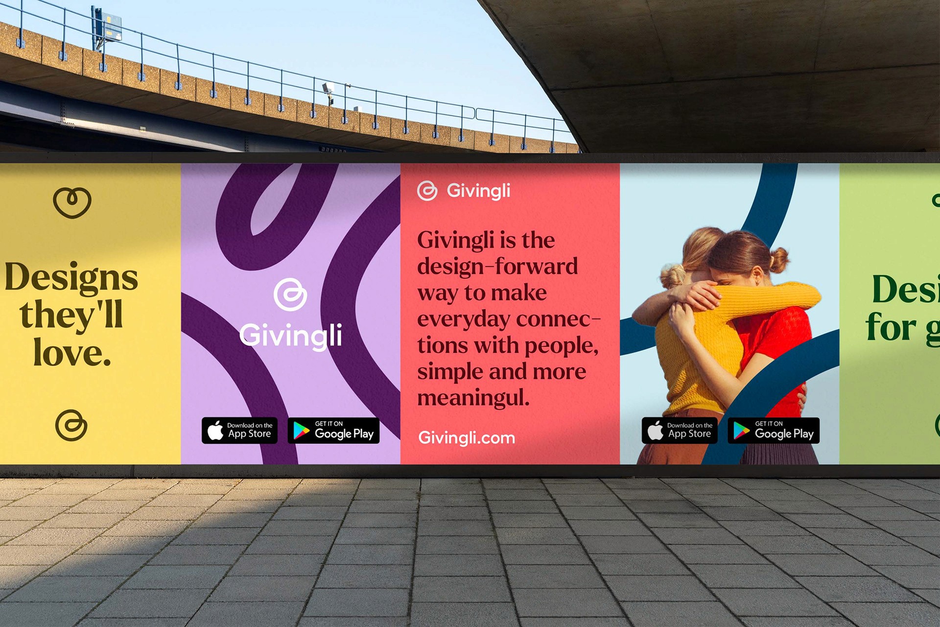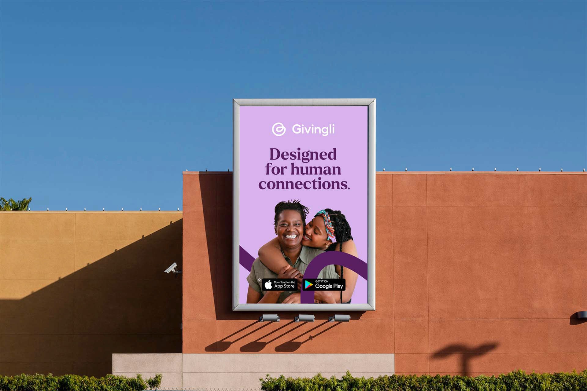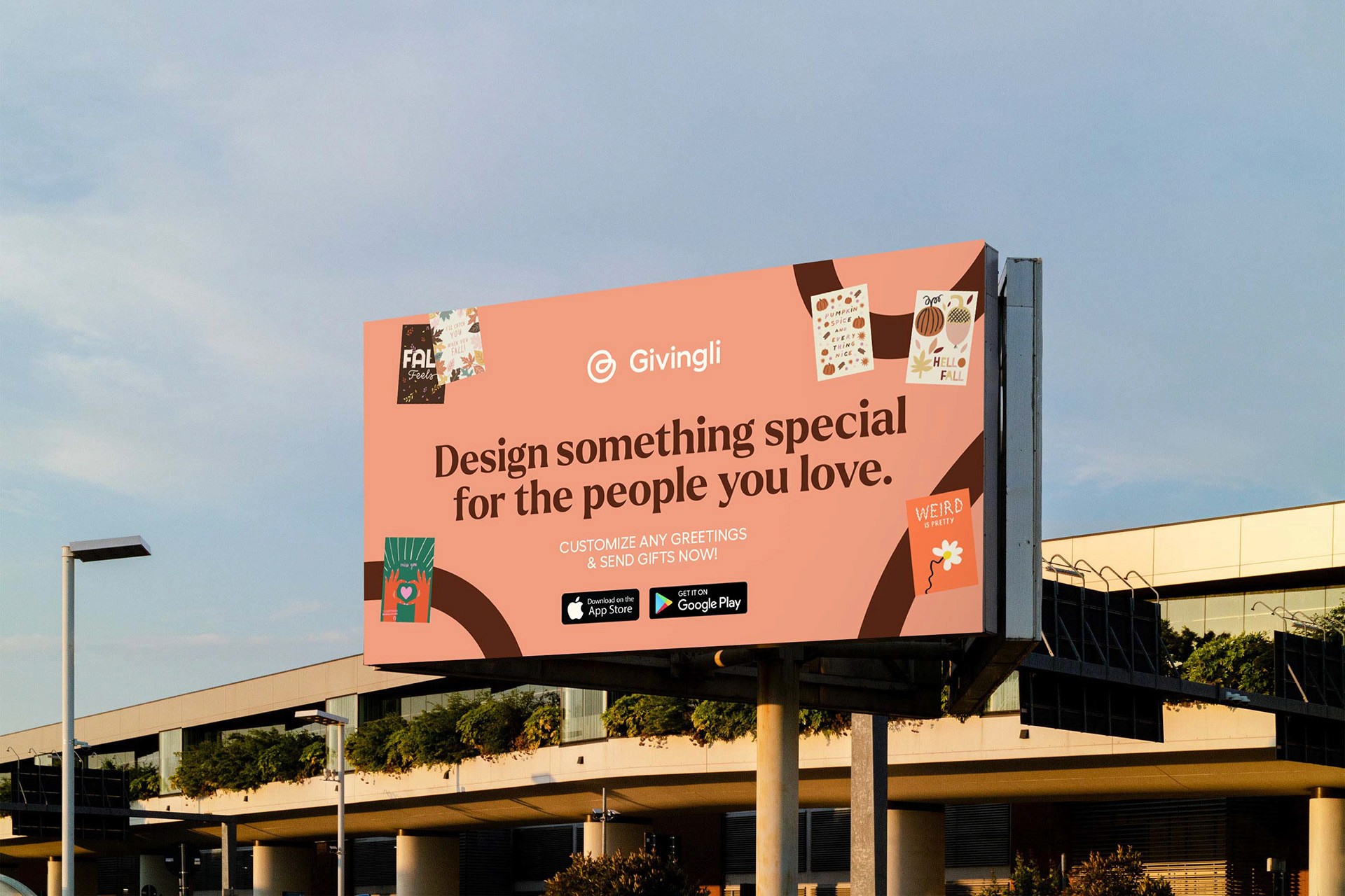
Givingli is the design-forward way to make everyday connections with people, simple and more meaningful.
Challenge
The challenge was to create a symbol that reflected the different main pillars of Givingli's values, being connection and gift giving. The identity had to be inviting and flexible to allow for the creation of different mediums connecting the gifts and the people giving and receiving the gifts.
Solution
The system had to be flexible according to the different media and the different themes addressed. Human Odyssey in red, Ecosystem Regeneration in green and Business Revolution in blue-violet.
The main typography, Stratos, carries the values of 21ST. Wishing to impact society through its actions and current issues. This typographic choice affirms a will of change without compromise. The result is a visual identity that carries the values and ambitions of 21ST through a flexible and recognizable system without seeing the logo.


